3. The Art of Visual Language
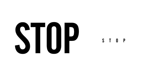
Various fonts and typefaces carry a lot of meaning and character in the way that they look. You must remember this when you are choosing a font for your next project—a font can completely change an intended message depending on how or where you use it. Look at this illustration for an example.
“Stop” on the left seems to almost be screaming at you. Whereas, “stop” on the right is very timid, faint and almost weak.
Jessica Hische, a well-known and respected letterer, illustrator and blogger wrote in Upping Your Type Game:
“Typefaces definitely have personalities…I usually want something even-tempered and laid back but not lacking in personality. Finding typefaces with the right personality balance can be incredibly difficult…”
Typography is the vehicle through which we communicate tone of voice, age, gender, emotion—and it can be easily manipulated. Visual characteristics of the font do speak louder than words.
Font Tip: Your designer will use certain typefaces and fonts for a reason. Feel comfortable to ask why—designers love to talk shop!
4. What’s the Big Deal?
Does a well-thought-out font choice really matter? Do people really notice when a bad font was chosen? Does it really dictate what people do?
Absolutely! And here’s a prime example:
In 2009, PepsiCo’s popular orange juice brand, Tropicana Pure Florida Orange Juice, underwent a major rebranding.
If you look closely, the name “Tropicana” changed from its classic font look to a hip, sans serif looking font… and within two months, sales dropped a whopping 20%, costing the brand tens of millions of dollars.
Needless to say, they quickly got rid of the new look. The font on the classic carton of orange juice WAS Tropicana. The font felt and had a visual message that was meant to be forever with Tropicana. Anything else just seems stale—and really, who wants stale juice?
Font Tip: Fonts matter. People are being consciously and subconsciously influenced and directed by various font choices all the time. Be sure you’ve considered all the direct and indirect impacts of your font choices because they can drastically dictate how your audience feels, and even how they’re called to action.
5. Stick with What Works
From a brand perspective, stick with what works. Don’t get too excited about constantly changing just because the times are changing. If you have a visual landscape that works, stay there. Don’t go changing fonts and typefaces for no apparent reason. However, there are plenty of businesses that have changed with the visual landscape for the better. If you sense that your brand is ready for a refresh, be creative! Experiment with different kinds of fonts and have fun.
Font Tip: Know when to ask for help. Deciding on a visual direction can be hard. Don’t hesitate to bring in the professionals if you’re not totally sure where to start! A professional digital marketing agency should not only be capable to help you, but excited and happy at the opportunity work collaboratively to figure out the next big step to strengthen your digital presence.
I hope you’ve enjoyed this post. You can always find me on Twitter and Designspiration, and I hope you’ll check back soon for part two of my three-part typography series!


