Colleges and universities have it tough these days when it comes to attracting new students. Why?
- According to enrollment data from the National Student Clearinghouse Research Center, higher education enrollment declined 3.1% from spring 2021 to spring 2022 — with an additional decline of 0.5% into spring 2023, leaving colleges and universities nationwide with almost 1.2 million fewer students than in 2019.
- In an Inside Higher Ed article, Doug Shapiro, director of the NSCRC, predicts continuing challenges to higher ed enrollment numbers beyond 2023, including “rising tuition costs, anxieties about student debt, and growing doubts about the value of higher education in general.”
- In addition, experts such as Carleton College professor of economics Nathan D. Grawe have spent the last few years warning of a looming “higher education demographic cliff,” a drop of approximately 15% in the number of college-aged students by 2026.
So, how does higher education website design play into all this? Effective digital marketing is essential for schools to differentiate themselves from the competition and prove their value to prospective students — and your college’s website is the foundation of your digital marketing strategy.
Top 5 Goals of Higher Education Website Design
The first step in laying a solid foundation for higher education digital marketing is understanding what your website design should be trying to achieve. If you’re looking to grow your enrollment numbers, your goals should include:
- Attracting students through SEO. For students to consider your school, they need to find you first. Optimizing your site for your audience’s most common search terms is absolutely essential.
- Communicating value. Everything from the design, to the UX, to the messaging of a college’s website needs to speak to your prospective student about why they should choose your school over any other.
- Nurturing and converting early-stage leads. Many colleges and universities make the mistake of focusing only on the bottom of their sales funnel, and neglect the vast majority of students who aren’t ready to apply, or even fill out a form to request more information. At Vital, we encourage our higher education clients to focus more on early-stage leads. (We’ll talk more about this in the Best Practices section of this post.)
- Providing the right information at the right time. Students who are considering your college and university want to know about campus life, degree programs, alumni career prospects, cost, and other basics, long before they hit “Apply Now.” Your website should make it easy for them to find what they’re looking for.
- Offering a variety of rich resources to engage students. Once you attract students to your school’s website, you want to keep them there as long as possible. Resources like a blog, downloadable eBooks, videos, and more can all be used to warm up prospective students as you gently guide them to consider applying to your school.
1. Goucher College
Why we love it: The Hero
In website design lingo, the “hero” is the main image, message, and (usually) calls to action (CTAs) that users see when they first come to a website. The hero is above the fold, which means users don’t have to scroll to see it.
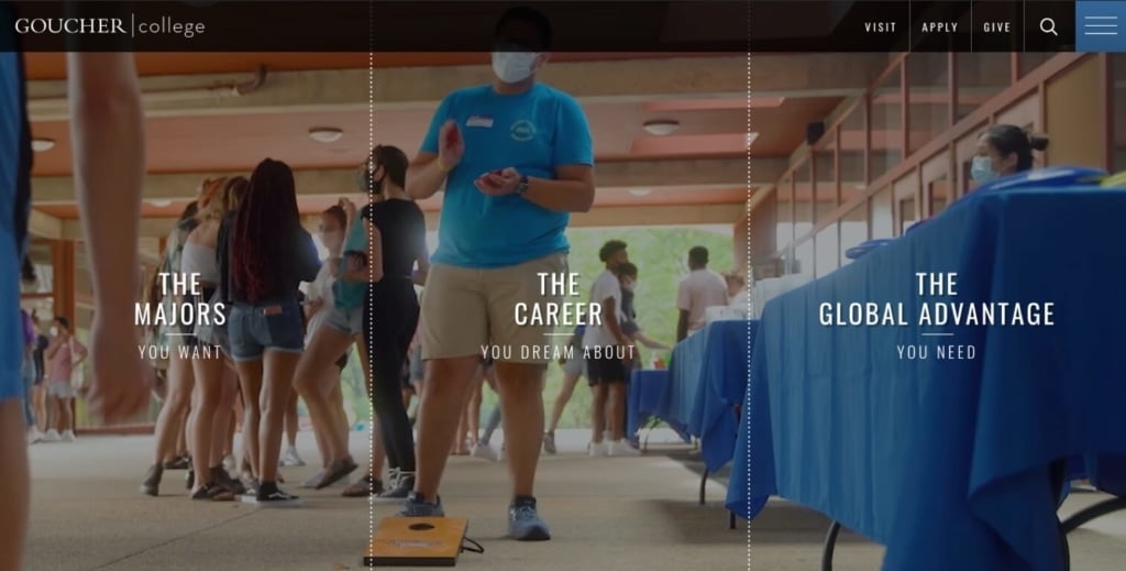
Why it matters: This is a college’s first chance, not just to make a good impression, but to meet students where they are, and guide them along their journey to enrollment.
How to get it right: What’s the difference between the best college website heroes and the worst? Attraction, simplicity, and alignment with user intent. (You’ll be hearing a lot about that.)
The hero section of Goucher College’s homepage hits all the right notes with warm, relatable campus life videos. We’re especially impressed by their CTAs, which avoid the bottom-of-funnel traps like “Apply Now” in favor of appealing to students who are more concerned with finding the right degree programs, advancing their careers, and having a great college experience (which includes study abroad opportunities, highlighted here). Great job!
The best higher education website heroes:
- Use video or impactful photography showing campus life.
- Clearly tell the user what the college or program they’re looking at offers, along with what they’re about to see as they scroll.
- Avoid abstract or “artsy” messages that don’t concretely connect with what prospective students are looking for.
- Don’t box themselves in with CTAs aimed only at the bottom of the funnel, steering clear of the overused and ineffective “Apply Now.” (And, to a lesser extent, “Request Information” or “Learn More.”)
Other University Website Hero Examples:
Rocky Mountain College of Art & Design
Rocky Mountain College of Art & Design
Rocky Mountain College of Art & Design
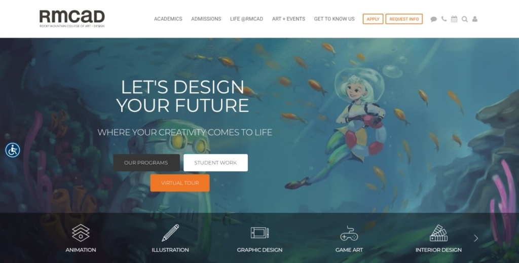
Rocky Mountain College of Art & Design stands out from the throng with an image of student work. The headline and supportive copy speaks directly to the aspiring student. And while the design of the CTAs is a little strange, the copy is strong: Our Programs; Student Work; and Virtual Tour. All allow prospective students pathways to explore the school further before committing.
Pomona College
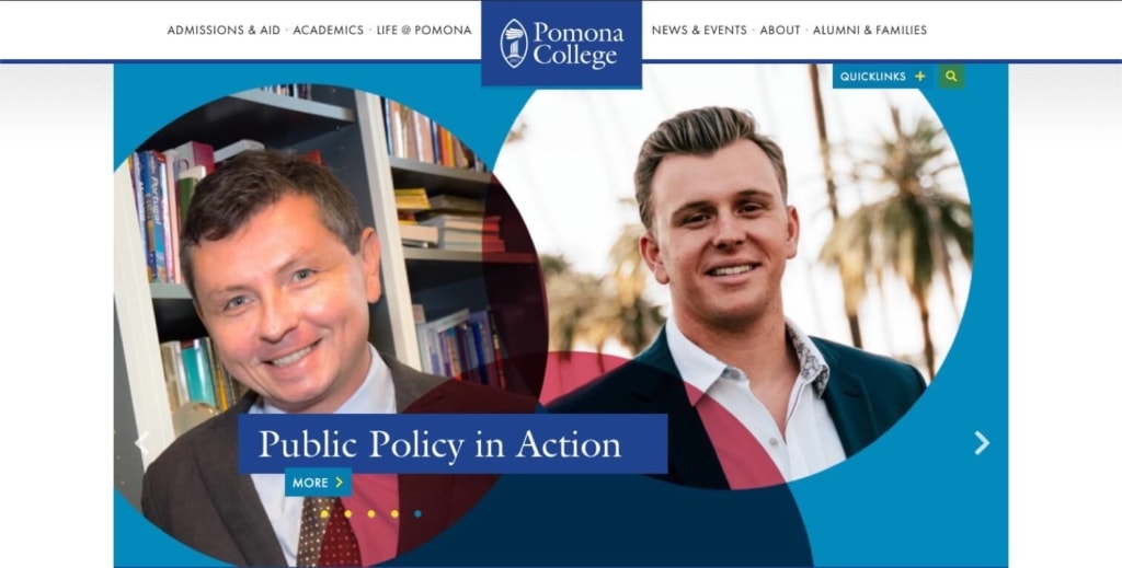
Southern California liberal arts college Pomona chose to go with a carousel hero that highlights five different news items — each one of interest to only a tiny percentage of prospective students. In our experience at Vital, carousel heroes decrease engagement because most users don’t have the patience to let all the images scroll.
2. San Francisco Film School
Why we love it: The video and photo gallery
Prospective students want to get a taste of campus life. Colleges and universities can give them what they want without leaving home, through effective use of videos and photo galleries.
You’d expect no less from one of the country’s top film schools, and this video from San Francisco Film School delivers. From gorgeous shots of the Golden Gate to footage of students working on their craft, the video invites viewers to imagine themselves “living the life” of an enrolled student.
Why it matters: Photos and videos build empathy and trust with your prospective students. Beyond that, videos on websites are proven to:
- Increase traffic by as much as 41%. (Aberdeen Group)
- Engage users and keep them on your site an average of 88% longer. (Mist Media)
- Improve search rankings and increase your college’s chances of showing up on the first page of Google search results by 53x. (Search Engine Journal)
- Improve your site’s conversion rates by 34%. (Aberdeen Group)
How to get it right: Drone footage of college campuses is incredibly popular these days, for good reason — it lets students imagine themselves in the space, which is a great first step towards considering applying, and ultimately enrolling. The same goes for photo galleries of student life.
Vital also highly recommends using video to inform your audience. Consider creating individual program videos that explain your academic offerings, and/or an admissions video that walks prospective students through the process.
The best university website video and photo galleries are:
- Professionally produced. It’s worth the expense to hire experts.
- Authentic. Avoid stock photography, as well as footage that comes across as fake or staged.
- Specific to your school. Your videos and photos should clearly communicate what makes your school unique, whether that’s a particularly gorgeous campus, intimate class sizes, fun extracurriculars, a huge sports program, and so on.
Other Higher Education Website Design Photos & Videos
Bates College
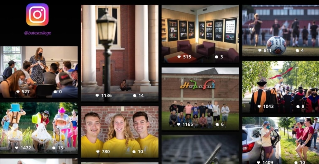
The Bates College homepage includes a gallery of their most-liked Instagram photos, which really gives a feel for campus life. Hover over an image to see the caption, and click to go to the school’s Instagram page. This is a great tactic to engage prospective students and encourage them to connect with you on social media to further develop the relationship.
Kenyon College
Don’t get us wrong — this is a super cool-looking video. It’s artsy and unique, and it tells the story of one student’s journey to Kenyon. But will it help increase conversions or enrollment? Ultimately, probably not. Why? It focuses too much on the abstract and not enough on the lived experience of being at Kenyon, thereby missing the “empathize and connect” boat.
3. Walden University
Why we love it: The messaging
Website messaging includes all the words you choose to convey your college’s value to its audience.
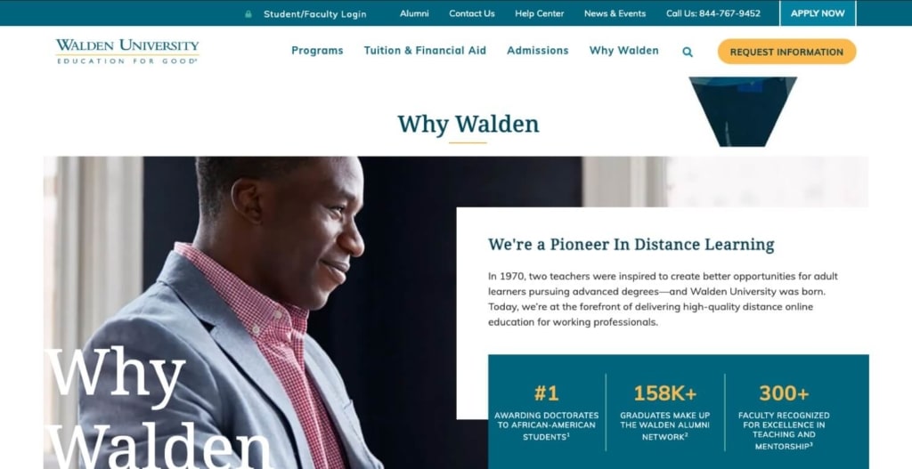
Walden University is a for-profit, online-only school that’s 100% comfortable with tooting its own horn — in a good way. The “Why Walden” section of the school’s homepage touches on its history and its mission (“delivering high-quality distance online education for working professionals”), paired with validating statistics that communicate the school’s differentiating value.
Why it matters: For colleges looking to grow their programs, it’s critically important to know your audience and to craft messages that are relevant to their interests and intent. Students need to know that they’ve come to the right place — immediately. Headlines and supporting messages that speak clearly and directly to the types of students you want to attract will keep your bounce rates (the number of people who leave your site without taking action) low.
How to get it right: Take the time to research and get to know your prospects. Conducting surveys of current students about why they chose your school can go a long way towards helping you craft messages that will grow your enrollment numbers.
The best university website messaging:
- Is crystal clear and immediate. According to research by the Nielsen Norman Group, “Users often leave Web pages in 10–20 seconds, but pages with a clear value proposition can hold people’s attention for much longer. To gain several minutes of user attention, you must clearly communicate your value proposition within 10 seconds.”
- Communicates your differentiating value. Remember, you’re competing against roughly 1400 other schools. You have to tell your future students what makes you different — and better.
- Speaks directly to your audience. If growing your enrollment numbers is your goal, you need your website to speak primarily to prospective students (and, if you’re going after undergraduates, their parents). Make it easy for current students, alumni, faculty, and other audiences to find their way through navigation, but keep your top-level messages focused on your prospects.
Other Higher Education Website Messaging Examples
Moore College of Art & Design
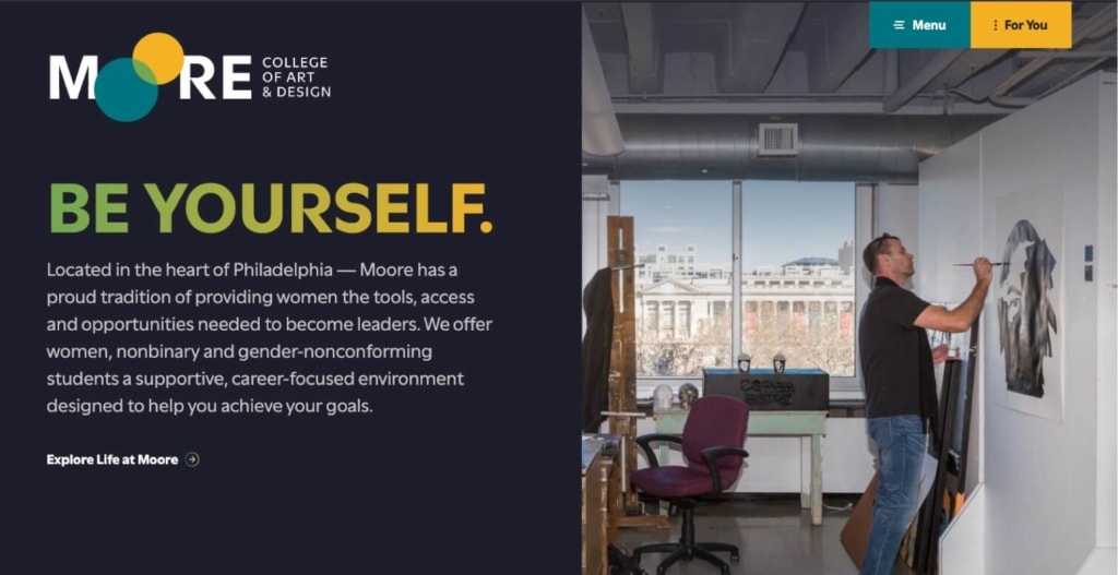
Be Yourself. This headline is the foundation of Moore’s messaging, which is simple, direct, and crystal-clear throughout their site. The copywriting and messaging on the Moore College website does a great job of communicating who the school is for and why they should choose Moore over other art and design schools.
Massachusetts Institute of Technology
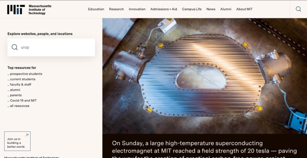
Massachusetts Institute of Technology
OK, MIT has a pretty big job (and an even bigger reputation). Still, it would be nice to see messaging that speaks clearly to some audience. Instead, they have a site almost entirely devoid of headlines. It functions as a dynamically generated database site, surfacing lists of “related content” without much context. As a result, there’s no cohesive message or reason to choose MIT (other than it being, well, MIT). Apparently, they’re resting on their laurels.
4. University of Phoenix
Why we love it: The user experience (U/X)
In web design and development, UX is all about organizing and presenting content so it’s as easy as possible for users to get where they want to go.
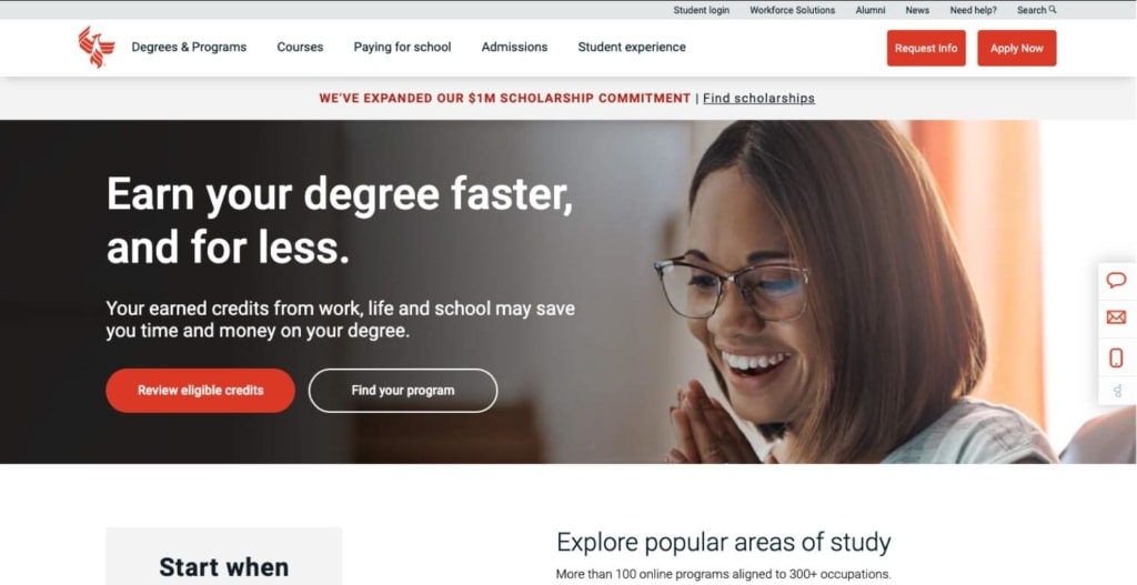
On the other end of the spectrum from the Ivies are the for-profit, online or hybrid colleges and universities. These schools operate like businesses — and their websites are much more likely to use the best practices of corporate, conversion-hungry sites. University of Phoenix’s UX features utility and top navigations that stay put when you scroll, so you don’t lose your way. Menus are simple and aligned with prospective students’ interests. And, we love the inclusion of three different ways to connect — chat, email, and text — in the gutter nav to the right. (That one also stays put as you scroll.)
Why it matters: The irony of UX is that, when it’s done right, users won’t even notice — but get it wrong, and you leave a very bad impression. Get it wrong enough, and prospective students will get frustrated and leave your site before you have a chance to convince them to stick around.
How to get it right: College websites should provide simple, easy-to-use navigation, search, and paths for potential students to find exactly what they’re looking for.
The best higher education website UX will include:
- A main menu that allows users to easily find all programs offered, along with supplemental information.
- A search bar for users who know exactly what they want. This doesn’t have to be super prominent but should be included on every page.
- Utility navigation for secondary actions and tools. Your search bar can go here.
- Search and filter for blog posts so users can dig into content relevant to their interests (and spend more time on your site).
Other Higher Education Website Design UX Examples
Arizona State University Online
Arizona State University Online
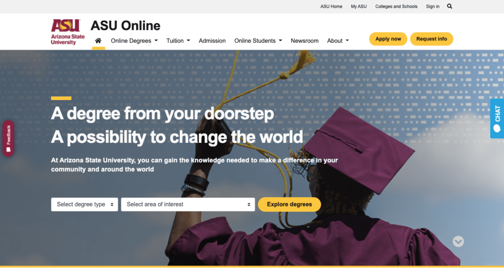
When it comes to UX, ASU online has its priorities straight, with intuitive navigation that guides prospective students to first explore programs, while making it easy to find out more about all their top-level concerns. The Apply Now button is there, but de-emphasized, and as you scroll down, the page sections mirror the top navigation.
Harvard University
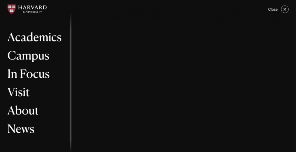
Between Harvard and MIT, you may notice a trend — apparently, more selective schools don’t have to worry about attracting prospective students, and their website design suffers as a result. Harvard’s homepage top navigation includes only a link to COVID information, a search bar, and what’s known as “hamburger navigation:” those two (or often three) little horizontal lines that you have to click to see the full menu. In Harvard’s case, when you click the hamburger, instead of dropping down a menu (which is what users have come to expect), it loads an entirely new page, which is mostly blank, with huge-font menu options on the left. Notice the entire lack of an “Admissions” link (it’s not even there if you scroll down). Huh.
5. University of San Diego
Why we love it: The offers
An offer is anything of value that a prospective student can get on your website in exchange for information, usually via a form. Think eBooks, webinars, checklists and comparisons, virtual tours, etc.
University of San Diego Online
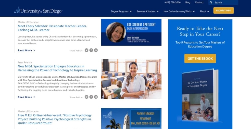
Vital client University of San Diego Online shines when it comes to their gated offers to generate early- and middle-of-funnel leads. Individual program pages are peppered with relevant eBooks and webinars. Just as importantly, their blog, which draws users in via SEO and engages them with rich content, directs readers to these resources as well. In this way, the school ensures that prospects who find them by searching for information about specific types of degrees or careers are offered highly valuable content in exchange for contact information.
Learn more about the USD online website and related Vital projects.
Why it matters: Gated offers are gold when it comes to conversion opportunities. Colleges today have many opportunities to provide resources in exchange for information — and if they’re not, they’re missing out on potential students up and down the funnel.
How to get it right: Get creative. The good news is, most colleges’ online offers start and stop with a virtual tour, so there’s lots of room to carve out a unique space for yourself. Use your SEO research to gain insight into what your prospective students are interested in, and craft rich content around that.
The best university website offers:
- Engage early-stage prospects. Things like college comparison charts (that paint your school in a positive light, of course), college readiness checklists, and eBooks about career prospects for specific majors are all of value to the vast majority of students who are still considering where to go.
- Work as an extension of your “free” content. Gated offers don’t stand alone, and you shouldn’t necessarily expect prospective students to be willing to fill out a form to get one until they’ve already spent some time on your site. Use free content like program pages and blog posts to warm users up, and provide relevant gated offers as a value-add.
- Act as the foundation of a lead-nurture campaign. Once you get names, email addresses, and (maybe) phone numbers, be sure you have more content to build an automated lead-nurture email campaign that will keep students engaged with your school until they’re ready to apply.
Other Higher Education Website Offer Examples
Cornell University
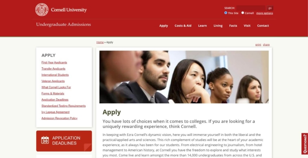
It’s not the best-designed offer we’ve ever seen, but this is an example of an Ivy League school that understands its admissions audience. Students considering applying to Cornell probably aren’t looking for eBooks or webinars on career prospects or even program details. First and foremost, they want to know how to get into such a competitive school. An online admissions information session, then, is a great chance to collect contact information from students who are already serious about applying.
American University School of International Service
American University School of International Service
American University School of International Service
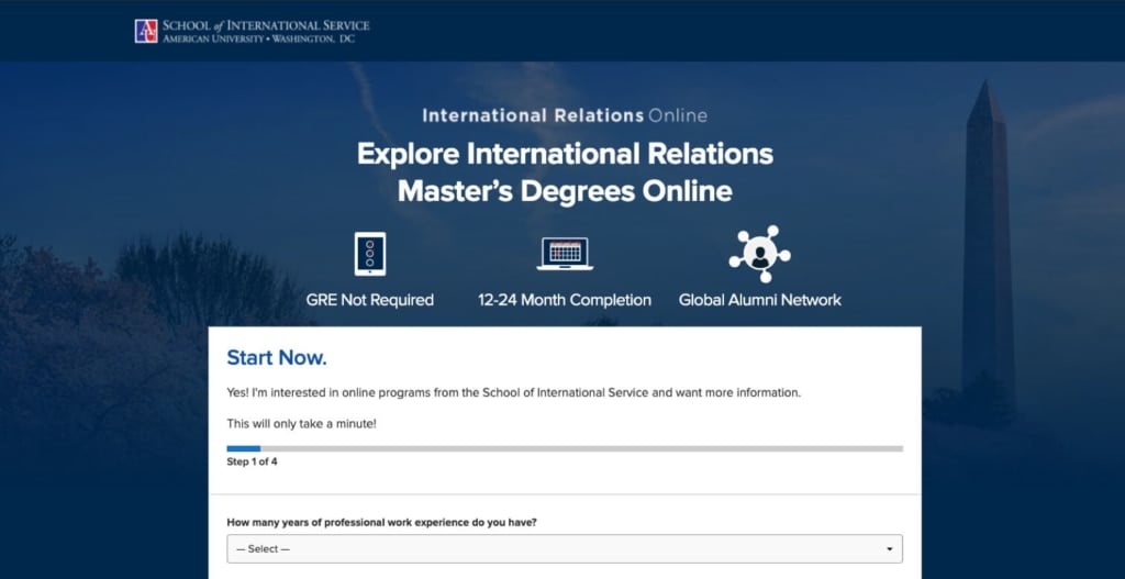
When it comes to gated offers, the bad is no offer at all. I came to this landing page through a PPC ad for the search terms “career prospects for masters in international relations.” Unfortunately, the school’s PPC strategy missed the first part of my search (career prospects) and doesn’t offer content that’s actually relevant to searcher intent. In other words, if I’m searching for “career prospects,” I’m probably not ready to fill out a form for information about a specific degree program. If they’d hit me with an eBook about career prospects for the degree, however, I might be convinced to give them my info.
6. Southern New Hampshire University
Why we love it: The calls to action (CTAs)
Calls to action, or CTAs, do exactly what it sounds like: tell a user what to click on, and what to expect when they click.
Southern New Hampshire University
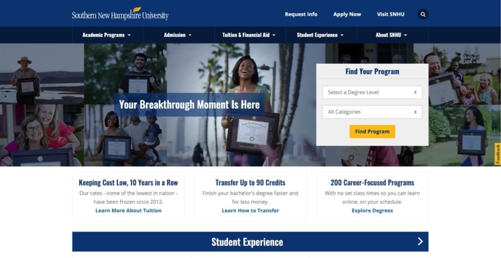
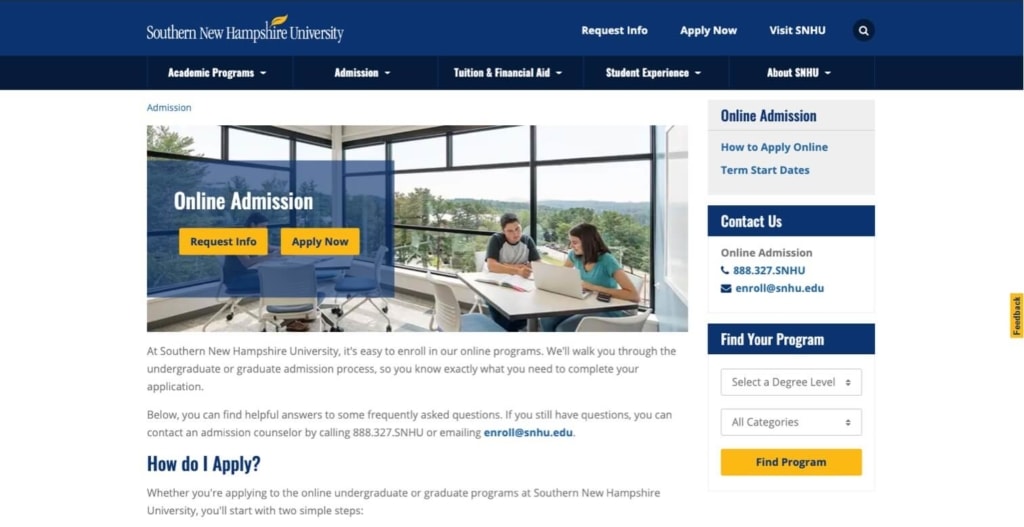
SNHU is known for the rapid growth of its programs and enrollment numbers. The school’s CTA structure is a significant part of the website lead-generation strategy that’s getting them there. They avoid “Apply Now” or “Request Info” in favor of the higher-funnel, lower-friction “Find Program” CTA on their homepage. They save bottom-of-the-funnel CTAs for visitors to their Admissions page (smart). And, with the yellow button that matches the leaf in the school’s logo and contrasts with the blue theme color, the design is right on.
Why it matters: Every time a college or university website gives a prospective student a chance to take an action, it’s an opportunity to connect with them exactly where they are on their buyer’s journey. Get it right, and conversions will follow. Get it wrong, and you won’t even know what you’re missing out on.
How to get it right: Make sure the words you choose for CTAs align exactly with what a user should expect (and want) to happen next. Experiment with CTA copy that completes the phrase: “I want to…” to craft what Vital refers to as “calls to value.” Run A/B tests to see what CTAs work best, and adjust accordingly. And, don’t neglect best practices in CTA button design. (See below.)
The best university website CTAs:
- Avoid high-friction words such as “sign up,” “submit,” or “complete.” These words and phrases imply work, and turn off prospective students.
- Are big in comparison to other page elements
- Use colors that contrast with the page background
- Use a consistent color for CTA buttons and other action areas throughout the site.
- Use button shapes that make it clear that they should be clicked.
Other Higher Education Website Design CTAs Examples
Goshen College
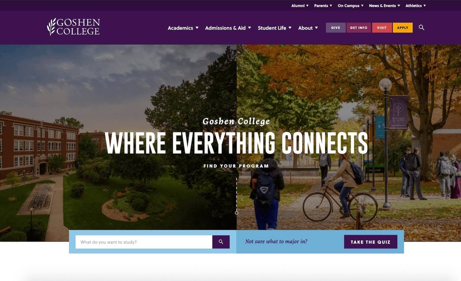
Who doesn’t like a good quiz? This homepage CTA to “Take the Quiz” if you’re “not sure what to major in” is unique, and one of the best. (The quiz itself is pretty cool, too. If it had a path to conversion, we would have considered it for the “Offers” section of this post.) Purple is generally an effective CTA color — but it would have been better for the school to choose a color that contrasts with the rest of the site.
Suffolk University
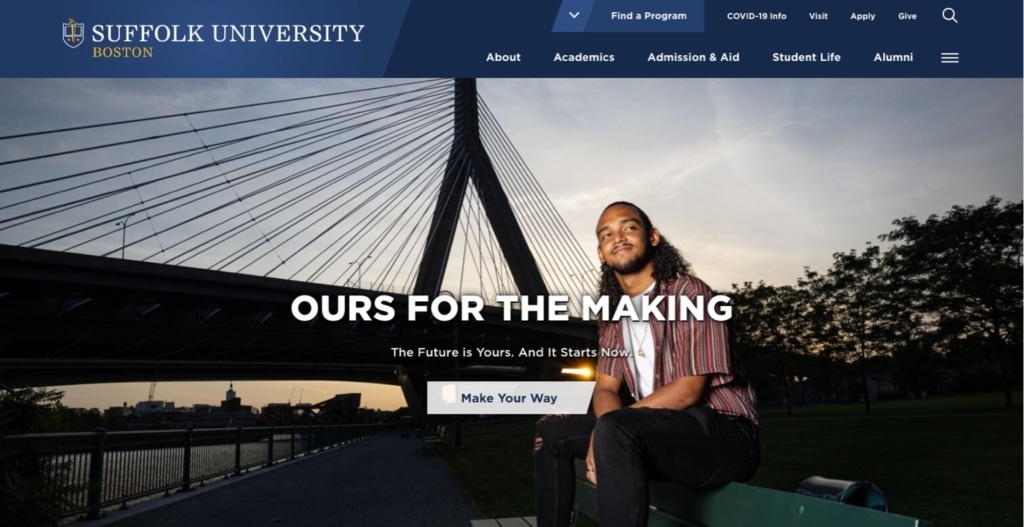
Remember when we said that the words on your CTA button need to align with user intent and expectations? Well, what do you expect to happen when you click a button that says “Make Your Way?” We didn’t know, either. For the record, it goes to the About page. And, yes, we get that it connects to the headline. Clever, but still not the best practice. In addition to the head-scratching copy, the button misses the mark design-wise: It’s white, rather than the bright yellow used for CTAs elsewhere on the site (hello, inconsistency), and the shape says, “We wanted to be different,” instead of, “I’m a button, click me.”
7. Yale
Why we love it: The virtual tour
COVID-19 changed the way schools approach prospective student tours — in many ways, for the better. We’ll take a look at how different schools are offering this feature, along with what works and what doesn’t.
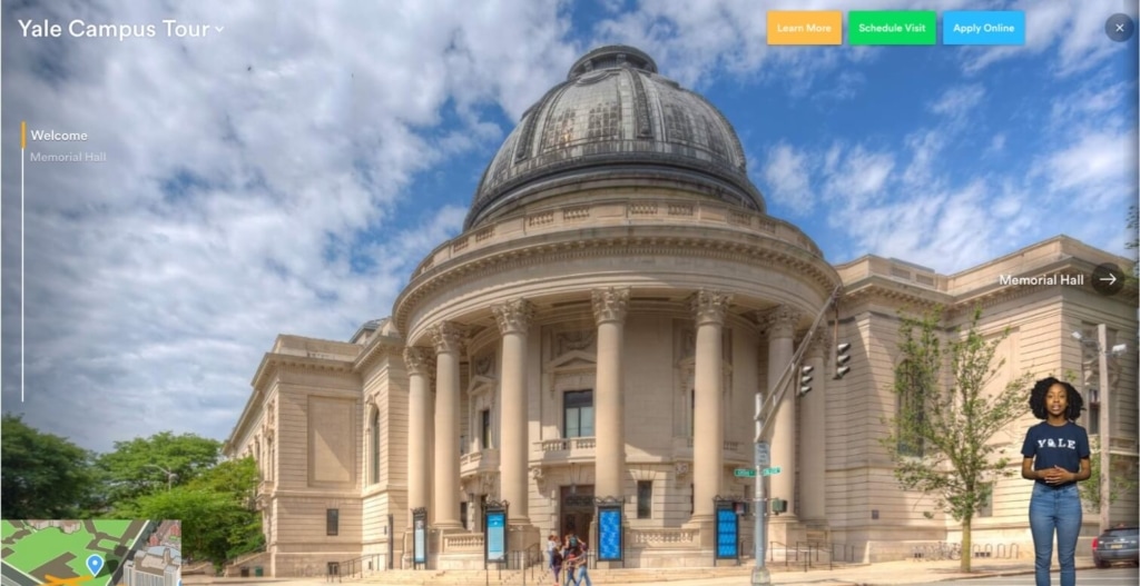
Here’s one Ivy that knocks the virtual tour out of the park. Yale’s admissions site offers six different tours, each guided by students. The tours are truly interactive, with clickable maps and arrows that allow you to navigate through 3D spaces. Accessibility features make the tours available to all users. CTAs are nice and visible throughout. And, the entire experience is super engaging and of the moment.
Why it matters: Virtual tours are a great offer — so much so that we’re giving them their own category. Online or virtual tours give prospective students an easy way to get a feel for the campus and student life. Like videos and photo galleries (but even more so), virtual tours encourage students to imagine themselves at your school.
How to get it right: Because the virtual tour is rapidly becoming table stakes for university websites, consider ways to make your tour stand out from the rest. Offer both live tours that students have to register for, and asynchronous, pre-recorded tours that students can watch on their own. If you have a lot of other gated content, you might consider making pre-recorded tours freely available as a way of increasing engagement, but keep in mind the trade-off in terms of lead generation.
The best university website virtual tours:
- Are authentic. Prospects appreciate tours that are led by current students, rather than admissions officers. (You can save those for the virtual information sessions.)
- Are ready for virtual reality. With the rise of VR headsets, colleges are able to make their tours more literally virtual. Pretty cool!
- Are more than just a one-off. Once you have prospects engaged with a virtual tour, it’s a great idea to offer them more — like sneak peeks inside dorm rooms, or map-based tours that offer different videos for different areas of campus.
- Vibe with how prospective students are used to consuming video. The next wave of college students are digital natives, and even older students are comfortable with the conventions of streaming video. Why not give them a whole YouTube channel full of tours?
Other Higher Education Website Design Virtual Tours Examples
Arizona State University
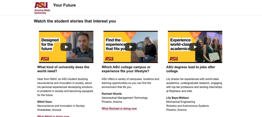
Arizona State University touts its “biggest virtual college tour ever” from its homepage hero. Click through, and you can stream it on Amazon Prime, or select episodes that interest you most. The entire experience is designed to get prospective students thinking about why ASU might be the school for them. And, for deeper engagement, you can click through to find out what the student hosts are doing now. (Spoiler alert: They’ve all gone on to great success in life, thanks to ASU.)
Davidson College
With its sad music and timelapse images devoid of human beings, the Davidson College virtual tour feels more like a eulogy than a promotion. The school does offer more videos, including some student-guided tours, but they chose this one to feature on their admissions site. We doubt it’s driving enrollment numbers up.
8. Penn State World Campus
Why we love it: The forms
Offers and CTAs go hand in hand with forms to collect information about your prospective students for lead nurturing and future marketing efforts.

Penn State World Campus saves its “request information” forms for individual program pages, where it’s much more relevant than it would be on, say, the homepage. The form itself is a well-designed, simple three-step affair that easily walks you through the information-gathering. Like DeVry, they miss the mark on the final CTA (no one’s perfect), but what sets this one apart is the ability to select more than one program of interest. That’s a rarity in college website forms and a big bonus for capturing “undecided” leads.
Why it matters: Forms are a higher education website’s #1 lead-generation tool. But, all too often, schools don’t put enough thought into their forms — and they lose conversions as a result.
How to get it right: The key word when it comes to forms is “friction.” You want your forms to be as low-friction as possible, which means making it (at least seem) easy for prospective students to fill them out, while still getting the information you need.
The best university website forms:
- Ask for the information you need in order to nurture your leads. At a minimum, you should ask for a name and email address. Depending on what type of prospects you’re targeting, you might also ask for the level of degree and type of program they’re interested in.
- Offer the ability to select multiple degree programs to capture prospective students who aren’t yet sure what they want to study.
- Avoid asking for a phone number unless you have the staffing capability to follow up — and if you’re sure that phone call will be worth the potential 47% drop in form submissions that this Vital case study found.
- Use step-by-step, or progressive forms, which ask for one piece of information at a time, often with a progress bar to show how many steps are left. These are proven to be successful, but they’re also more complicated to create.
- Use dynamic forms to pre-fill information based on past visits.
- Follow best practices for form design.
Other Higher Education Website Form Examples
DeVry University
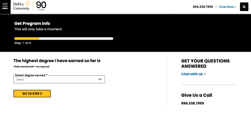
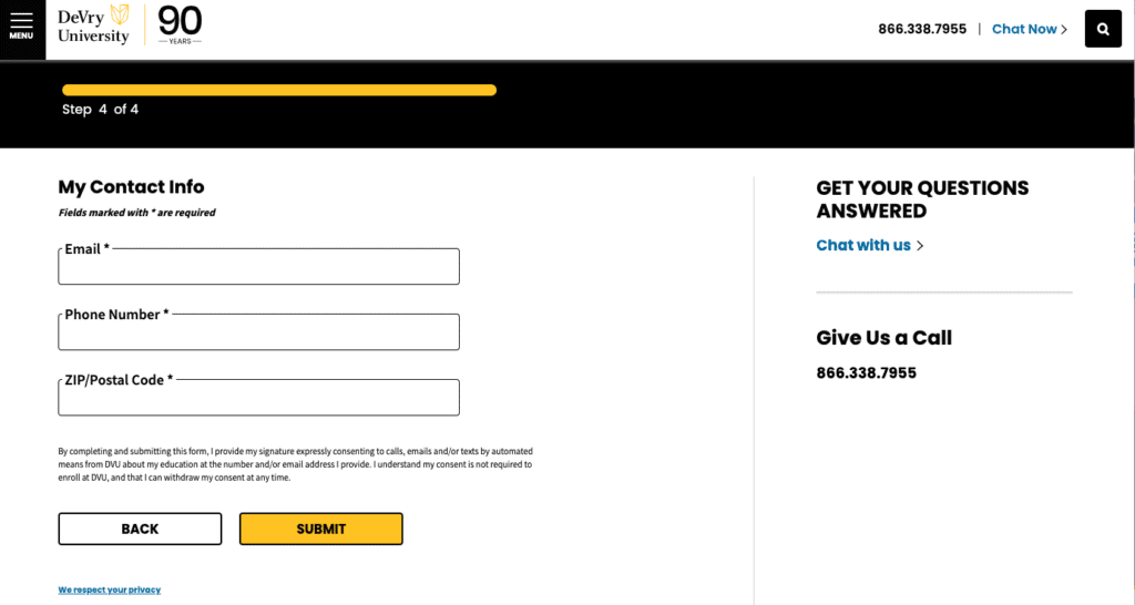
DeVry University knows a thing or two about generating online leads, and their forms are proof. They use step-by-step forms with a progress bar to make the progress seem as easy as possible. The mid-form CTAs to “Go to Step #” are a more effective replacement for “Next.” Our only issue is with that final CTA — we’d like to see a user-benefit-focused CTA like “Get Info” instead of “Submit.”
Elon University
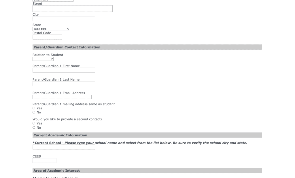
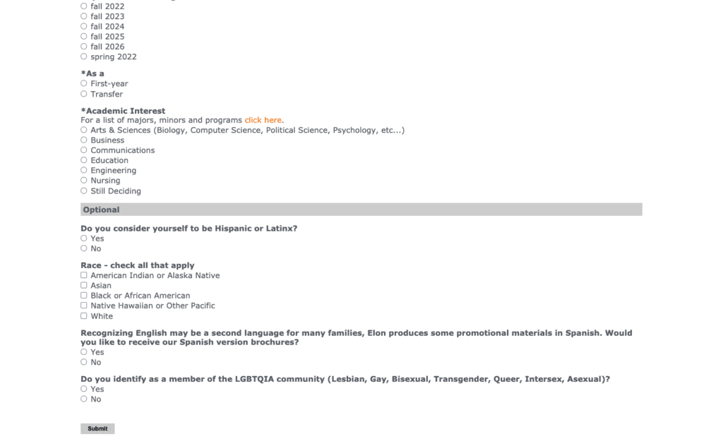
Yes, the form to request information from Elon University really is that long. Talk about friction! Even though most fields aren’t required, the school is asking way too much of prospective students. On top of that, the form design is as basic as it gets, and the CTA to “Submit” forgets that users don’t want to submit anything — they want to get information about the school.
9. University of Oklahoma Admissions
Why we love it: The chatbot
We’ll take a look at how colleges are using chatbots to increase engagement and drive conversions.
University of Oklahoma Admissions
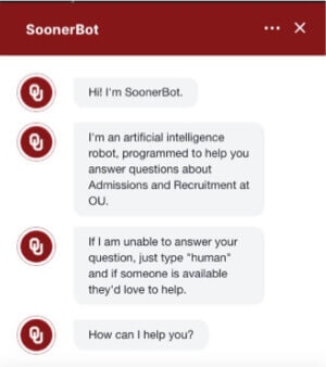
The University of Oklahoma uses SoonerBot, an AI chatbot, on its admissions page. Among its cooler features: It uses predictive text to suggest commonly asked questions, and it has a human “backup” in case you stump it. I especially appreciate that, while it didn’t collect information about me directly, it did send me to pages with conversion potential, such as this “find your major” assessment, which is linked to when I told it I didn’t know what to major in.
Why it matters: Chat is highly effective for engaging higher education website visitors. According to a study by Campaign Monitor, it’s been proven to convert traffic into leads that wouldn’t otherwise convert via alternative channels. In other words, it provides supplemental leads, rather than simply replacing form submissions. That means you’re increasing your overall conversion rates. Bingo!
How to get it right: There are a number of different ways to approach chat, and one size does not fit all. If you have the resources to support it, live one-on-one chat is particularly effective. If not, an automated chatbot can be a great option.
The best university website chatbots:
- Start by asking, “How can we help?” to establish that the bot is there to add value to the prospect’s experience.
- Personalize the question based on the page the user’s starting from. For example, if a user opens the chat function from a university’s MBA program page, the bot can ask, “Can I help answer questions about our MBA program?”
- Use data gleaned from what questions people ask to further customize chat — and even improve your overall website performance by continuing to refine messaging and offers.
- Capture lead information just like a form would. Also, just like a form, don’t ask for too much, too soon.
- Personalize greetings and responses for repeat users.
Other Higher Education Website Chatbot Examples
University of Wyoming
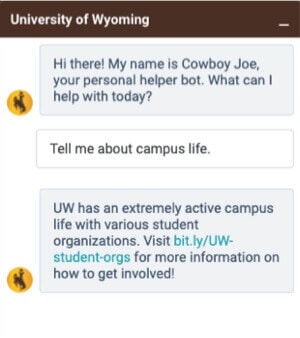
For a school whose motto is “The World Needs More Cowboys,” a chatbot named Cowboy Joe makes a lot of sense. Cowboy Joe does a good job of answering questions and directing users to relevant information. The only thing keeping this chatbot from the winner’s pedestal is its lack of conversion or data collection strategy. At no point in my conversation with Joe did he ask what programs I was interested in, or otherwise seek to gather information that might help the school market to me more effectively. However, this effectively keeps the barriers to communication low, which is a good thing.
Loyola University Maryland Undergraduate Admissions
Loyola University Maryland Undergraduate Admissions
Loyola University Maryland Undergraduate Admissions
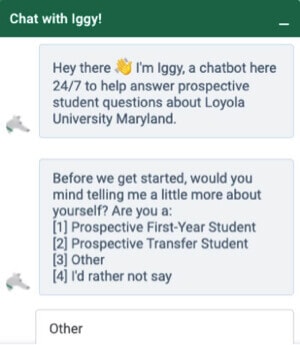
Like the University of Wyoming, Loyola University Maryland uses its mascot, a greyhound named Iggy, to give its chat some personality. Unlike Cowboy Joe, though, Iggy is a bit pushy, asking users to categorize themselves before they even get started, without offering value in return. If your university wants to limit how many people chat, and only get highly qualified chats, this might be a good approach. But as a general rule, there’s no such thing as being too open and accessible. We’d recommend saving the information-gathering until after your user has had a chance to ask some questions.
Higher Education Website Chatbots: Bonus Case Study
University of Georgia
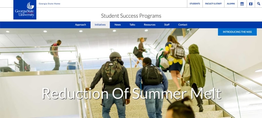
According to the Georgia State University website, summer melt refers to “the group of students who accept offers of admissions but subsequently do not show up for fall enrollment.” This cohort includes up to 20% of students from urban high schools, who get admitted to college but ultimately end up not attending anywhere. Georgia State introduced a chatbot named “Pounce” (the school’s mascot is a panther) to address the specific needs of this group of potential students. And it worked. Says the website:
“In 2016, during the first summer of implementation, Pounce delivered more than 200,000 answers to questions asked by incoming freshmen, and the university reduced summer melt by 22 percent. This translated into an additional 324 students sitting in their seats for the first day of classes at Georgia State rather than sitting out the college experience.” — Lindsay Page and Ben Castleman, Summer Melt, Harvard Education Press, 2014
10. University of San Diego Online
Why we love it: The blog
Most colleges and universities know they need to have a blog these days. But, do they know what to do with it? We’ll go over the good, the bad, and the ugly when it comes to college website blogs.

University of San Diego Online
We can’t point to a better example of an effective, lead-generating university blog than Vital client University of San Diego. We already discussed how USD online uses offers to convert prospective students and generate highly qualified leads. The university’s blog supports that strategy, with a ton of search-optimized posts on topics of interest to people looking for the programs USD offers. The blog drives organic traffic — then converts readers with high-quality, relevant gated content, all of which folds into a carefully constructed lead-nurture campaign designed to increase enrollment.
Learn more about the USD online website and related Vital projects.
Why it matters: Your blog is your most powerful SEO tool. By creating search-optimized content, you can use your university website’s blog to generate long-term leads, especially early in the funnel.
How to get it right: Begin with a strategic, targeted SEO approach. At Vital, our SEO strategy for colleges and universities is pretty in-depth, but a good place to start is drawing up a list of keywords that are relevant to your particular programs, and researching their search volume and competitiveness. If your posts aren’t ranking high enough, take a look at your competition and figure out what you need to be doing better.
The best university website blogs:
- Focus on early-stage leads with subject matter that’s of interest to people “just looking” for degree programs.
- Use deep SEO knowledge to rank for important keywords.
- Provide rich, engaging content that moves prospective students down the funnel toward your gated offers.
- Keep in mind alternative admissions audiences, such as parents and families, particularly if your goal is to grow your undergraduate program.
More Higher Education Website Blog Examples
University of Cincinnati Online
University of Cincinnati Online
University of Cincinnati Online
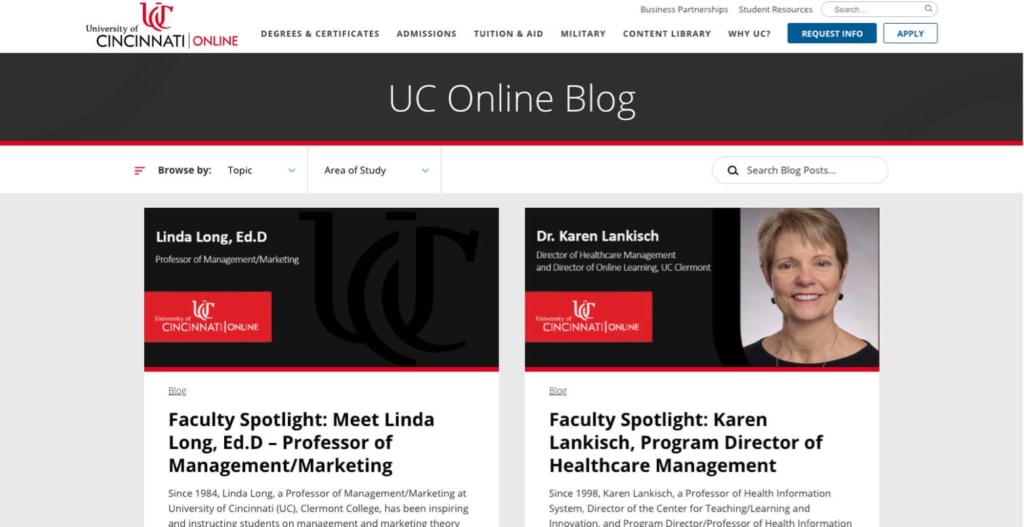
The University of Cincinnati Online’s blog does pretty much everything right, publishing dozens of articles designed to capture the interest of potential students from the earliest stages of consideration to those ready to apply. Blog posts are optimized (and rank) for high-value search terms, so it drives a lot of traffic that turns into leads. Users can browse over two dozen topics and UC online’s 15 areas of study, with the ability to select more than one of each. There’s also a search bar to help you find exactly what you need.
Read more about the University of Cincinnati Online’s website and related Vital projects.
University of Virginia
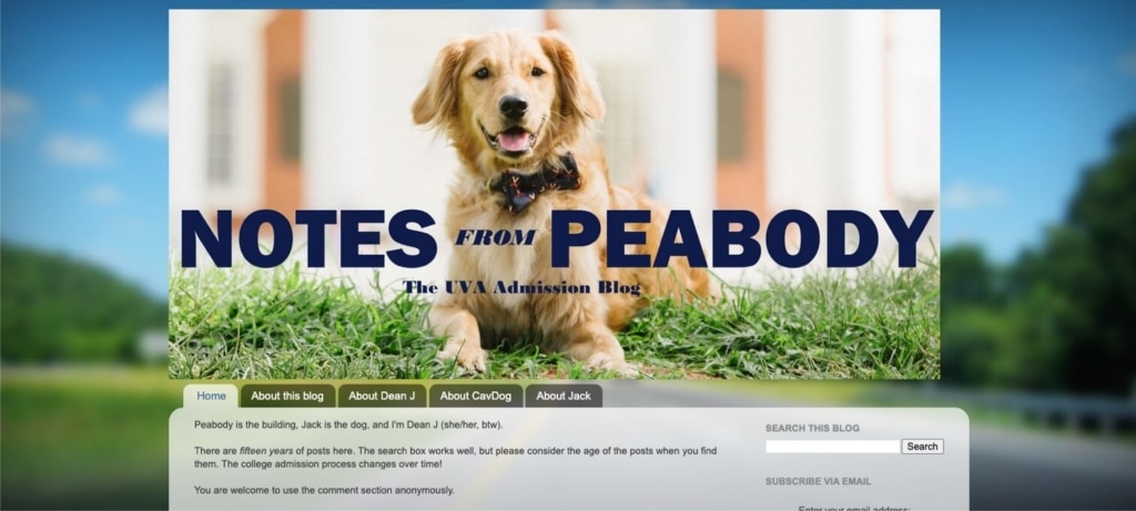
Let us preface this by noting that Peabody, the UVA admissions blog dog, is adorable. And the blog, written by Dean J, an associate dean in the office of admissions, is appealing enough to a certain audience that parents on the discussion forum College Confidential call out Dean J by name and praise her “transparency.” That’s all great stuff. (Really!) But, the blog intro says it contains 15 years of content — and unfortunately, it looks like the blog design and strategy haven’t been updated since the early days. It’s too bad to see such a wealth of content suffering from a lack of UX and SEO best practices.
Rebuilding Your Website: Higher Education Website Design Best Practices
If your college or university is looking to increase enrollment through website leads, where do you start? Whether you’re in need of a complete website overhaul, optimization of existing content, or anything in between, here are a few best practices to keep in mind:
- Start with strategy. It can be easy to fall into the “pretty design” trap when building a new website. Big mistake. Of course design matters, but at Vital, strategy always comes first. That means understanding how you want your site to perform in terms of SEO, as well as site structure and navigation, paths to conversion, and so on.
- Don’t neglect early-stage leads. When evaluating your website’s design, messaging, content, gated offers, and CTAs, remember that most visitors are not ready to apply. Take a few steps back and appeal to those in the “consider and compare” phase, and you’ll have more success generating and converting leads.
- Save “Apply Now” for interior admissions pages. Designing a homepage hero with an “Apply Now” button is a little like expecting a marriage proposal on your first date. Not gonna happen. Instead, take the time to get to know each other. Make it easy for your audience to find the information they want about your programs, campus life, etc. Keep them clicking and coming back for more, and they’ll be much more likely to hit that “Apply Now” button — when they’re ready.
- Provide multiple paths to engagement. Go ahead and provide a form to request more information on your admissions and programs pages, but don’t stop there. Give people options. Users reluctant to fill out a form may engage with chat features, or the ability to connect to current students, or virtual information sessions, etc. There’s no such thing as making it too easy to connect.
- Content is king. At Vital, our most successful university and college website clients got where they are by producing a wealth of valuable content for prospective students up and down the funnel. This includes “free” content like blog posts, and gated offers like eBooks and webinars. But don’t just start writing whatever you feel like. Go back to step one — strategy. Strategic content is based on high-value search terms and guides your prospects down the funnel, step by step.
Let’s talk about higher education website redesign
Interested in learning more about how a high-performance website can help your school boost its enrollment numbers? Contact us.