3. Does this typeface have a good x-height?
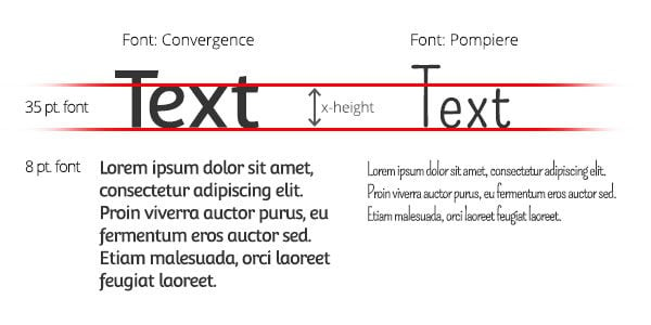
The x-height is how tall a lower case letter is relative to an upper case letter. This is important to recognize—especially when you start writing out body copy for web and print media. Look at the x-height differences between these two fonts:
They are exactly the same point size. Yet, because of the x-height difference, one looks smaller than the other and is therefore much harder to read. The smaller the x-height, the smaller the font looks. If your font has a good-sized x-height, the readability is much better.
Font Tip: Checking on a fonts’ x-height might seem trivial, but it’s very valuable to have a tall x-height. The point is to choose a typeface that allows you to read things seamlessly and with ease.
4. Does this font stand the Il1 test (uppercase I, lower case l, the number 1)?
Are you using a sans serif font? Be warned, fonts like this can be the trickiest when used for large amounts of text. You want a font that flows. Stumbling though a sentence is no way to read large amounts of text.
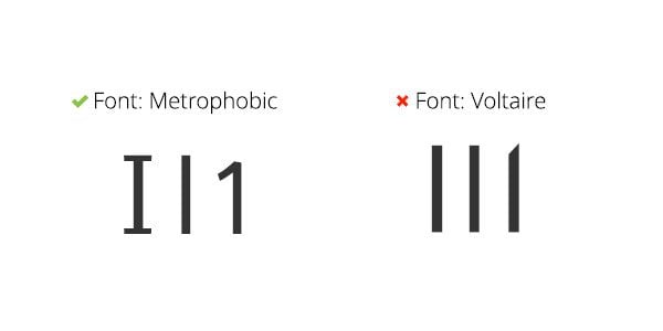
Jessica Hische, a well-known type designer and letterer, has a very good trick to help you choose the best font for large amounts of text. When you choose a font, type an upper case I, a lower case l, and the number one together, like this:
You should be able to tell the difference between the letterforms. As Jessica notes, that this is not “the ultimate legibility determiner, but it helps.”
Font Tip: Using the Il1 test can really help you narrow things down if you have a few typefaces that you can’t decide between. Always go for better legibility. Otherwise, your readers may bail.
So there you have it. Now you are armed with four great questions, which means that when you are ready to choose your next typeface, you can do so with more certainty! Asking yourself these questions will really help you decide on something that will stand the test of time and ultimately carry your brand to the next level.
And here are some good resources that offer a variety of great typefaces:
As you can see, there are a lot of great free fonts out there, and there are some spectacular typefaces available for purchase. But as always, you get what you pay for. Do your research and make sure you are comfortable about your typeface decisions.
If this was helpful to you, or if you have any questions, let us know! You can find me on Twitter and Designspiration. And of course, check back soon for the final chapter of my three-part typography series!


