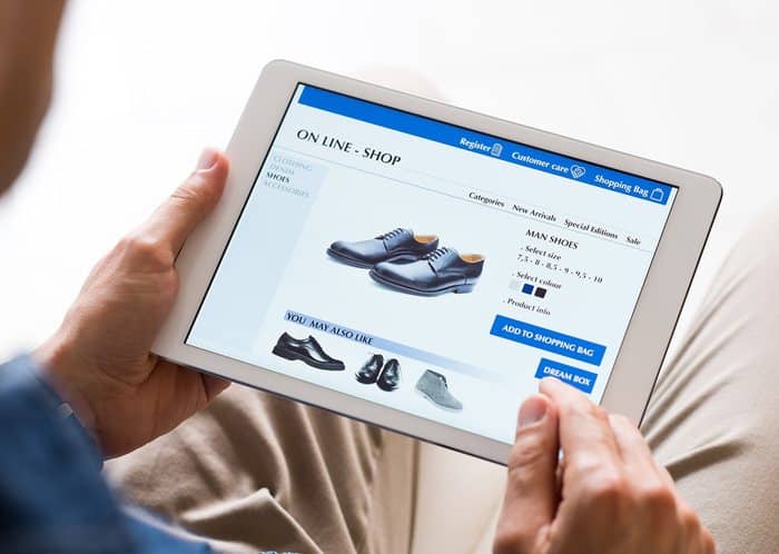
When most people think conversion rate optimization (CRO) they immediately jump to conclusions about the cost and headaches of implementing a strategy. While implementing a CRO strategy may seem like a daunting task, imagine what improving your conversion rate by even 2 percent would mean to your monthly sales revenue. This post will give you some pointers on how to minimize those headaches and improve your eCommerce website conversions.
A Few Tips:
- Utilize Google Analytics to Optimize Your Best Performing Content
- A/B Test Your CTA Copy & Placement
- Start Thinking Like a Consumer (put yourself in their shoes)
- Optimize Your Page Structure & Product Pages
- Improve Your Internal Search
- Treat Your FAQ Page as a Working Document
- Use Heat Mapping Tools
- Add Video to Product Pages
- Ease the Checkout Process
1. Utilize Google Analytics to Optimize Your Best Performing Product Pages (It’s your best friend when trying to pull answers from your data)
Track your best-performing pages in Google Analytics, searching for pages with high traffic and low bounce rates. This tells you a large number of people are coming to your product pages, and doing one of two things: they are staying on that page to learn more (because they find the content compelling), or they are being driven to another page on your site (hopefully the checkout page!).
Once you have established which pages are driving the most traffic, you can optimize the content on those pages to rank for high-search-volume keywords.

The first step in fixing this issue is to perform keyword research and optimize your content based on the high search volume keywords that you identify. When you do this you may realize that the search terms “men’s casual dress shoes” and “leather dress shoes” have high search volumes. As such you will want to use these phrases within your post and then link them back to the corresponding product pages on your website.
This technique will help you usher customers down the sales funnel, from a blog post they found through organic search to a product page on your site, where they will hopefully be compelled to purchase.
Another option is to link text in your blog to a video or FAQ page. This educational approach gives your shoppers more in-depth product or company information with the end result of improving consumer confidence and trust.
2. A/B Test Your CTA Copy & Placement
Have you ever wondered why that eBook or whitepaper you launched last month isn’t converting as well as you thought? Well, it could be your call-to-action (CTA) buttons falling flat.
Let’s say you have created a landing page around a size and style guide for your new line of men’s casual dress shoes. After a short description of the guide that leaves the consumer wanting to know more, you have placed a CTA at the bottom of the page. The copy on that CTA says, “Download Now.”
What if you changed the copy to “Try It for Free,” or “What’s my size?” or “View All New Styles”? Would conversions increase?
A/B testing CTA copy can give you more insight into what drives your potential customers.
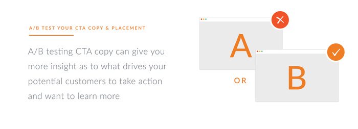
Have you ever read an article online, wanted to learn more and noticed a well placed CTA button jumping out at you to read more? Well, whoever made the decision to place the CTA right there probably knew that you would be compelled to click based on traffic data from the number of downloads.
By testing the placement of the CTA (whether it be at the bottom of the article, sidebar or in the middle) will help you pinpoint that page’s conversion sweet spot.
3. Starting Thinking Like a Consumer
Sometimes you have to take a step back and put yourself in the mind of an online shopper who is coming to your website for the first time. When analyzing pages, ask yourself questions like “what question does this page answer?” or “why was I directed to this page specifically?”.
Remember, each page of your website should serve a purpose be it to attract, educate, convert or close. Ultimately, each page on your website should help identify and push the visitor further along through the buyer’s journey.

4. Optimize Your Page Structure & Product Pages
Optimizing page structure – Does your page structure reflect how you want to guide a user through your site? L.L. Bean is a good example. They have categorized hundreds of products they sell on their site into seven major categories. Each category has numerous subcategories that help a consumer narrow their product search. Their page structure leads shoppers to what they’re looking for, while also giving them the freedom to choose between multiple styles or products using simple on-page filters.
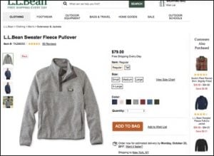
Optimizing product pages – Taking a look at L.L. Bean’s product page for a men’s fleece pullover, you can see how all of the product information is displayed in front of you.

5. Improve Your Internal Search Functionality
Have you ever left a website because of a frustrating experience trying to find a product?
Helping your shoppers quickly and painlessly find what they need, will help you drastically increase eCommerce conversion rates.
The first step to improving your website’s search functionality is to setup search in Google Search Console. This tool will track what your customers are searching for in relation to your products. This can help you identify what keywords to target on your product pages and blog.
The next step would be to setup contextual search functionality on your website. This helps guide the user as they search by offering appropriate keyword suggestions. Google is a master at this, increasing the precision of search results based on the user’s input. For example, if I start typing ‘best fall boots’ Google will provide me with a list of other search queries to help narrow down my search query.
6. Treat Your FAQ Page as a Working Document
Your FAQ page should be a working document or a never-ending laundry list on your website. Going back to searcher intent, think about what kinds of questions shoppers are asking when searching for your product. The more FAQ’s you have the better informed and aware your shoppers will be. This helps instill buying confidence and can mean the difference between an abandoned cart and a sale.
See how people are navigating to your FAQ page. This can be done through strategic CTA placement on product pages.
For example, say your business offers free shipping on all orders over $50 for men’s casual dress shoes, but you have not stated that this rule only applies to the continental United States. You should be driving that traffic to an FAQ page to help better answer this shipping question. An example of this could be placing an in-line CTA saying, “for questions on our free shipping policy visit our FAQ page.” The CTA would then direct the consumer to the FAQ page to better help answer his/her question.
7. Use Heat Mapping Tools
HotJar, CrazyEgg, ClickTale, Lucky Orange, etc.… There are many heat mapping tools that let you track shoppers on your site.
Heat maps help marketers see what areas of a website people are most attracted to and what areas need improvement. The flow of user interaction from the first page a person lands on to the last page a person visits can tell you a lot about how well your website is structured and how you can improve CRO. Heat mapping tools allow you to track user interaction on your website and are also great tools for testing landing page copy, CTA copy and CTA placement.
You can use heat mapping tools to:
- Determine how consumers navigate your website
- Identify patterns based on the navigation of your site
- Implement strategies to help better convert visitors along the buyer’s journey
For example, if you operate an eCommerce store that sells winter coats you should analyze heat-mapping data to see what pages customers are viewing most, based on the type and style of coat presented. If the majority of people coming to your website are looking for performance thermal coats yet they are being driven to product pages that show the everyday style of coats, you may want to reconfigure your sites navigation or internal linking structure.
Another benefit of heat mapping is the ability to track a website’s mobile vs. desktop experience. Are you confused why you are getting a ton of mobile traffic but sales are plateauing? This might be due to a poor user experience, confusing navigation or tough checkout process on your mobile site. By using heat mapping tools, you can easily compare both site experiences, determine user bottlenecks and improve your eCommerce mobile strategy.
8. Add Video to Product Pages
Let’s face it, people love to consume video content. Video helps instill confidence in shoppers and will reduce product questions they may have. Online shoes and clothing retailer Zappos, found that sales increased from 6 percent to 30 percent for when product videos were added.

Bottom line. Use video. It converts.
9. Ease the Checkout Process
According to Baymard Institute, a complicated checkout process can account for 27 percent of cart abandonment rates for any online retailer. To help reduce these high rates you can first try to remove any distractions for customers by creating a checkout window with minimal navigation. This allows the customer to focus solely on completing their purchase. Ideally, the checkout page should have one link that navigates away to the homepage in case someone decides to continue shopping.
- Reassurance is key. Provide a clear view of shopping cart prices and delivery charges (if any) to re-assure the customer of their total amount. Provide alternative payment methods, visible security logos or certifications to back up your product warranty. Distrust of payment is a leading cause of cart abandonment as customers can be skittish about placing their personal financial information online without such logos.
- Show a progress indicator. At every stage during checkout, the customer should know where they are in the process and what remains to be done before the purchase is complete. Including a progress bar that shows shoppers where they are during checkout is key to easing this sometimes-lengthy process.
- Let people use the back button. Sites should make it easy for customers to navigate back and forth through the checkout, but should also ensure that they can use the back button. Have you ever backed out after filling in your payment information to check the price of an item in your cart only to come back to the payment information page missing all of your previously filled out information? Let me tell you, it is the absolute worst. Design your forms to use this item field to allow previously entered data to be transferrable between forms if a customer exits at the checkout page.
- Default “Billing = Shipping” Field. Have you ever been frustrated at checkout when you have to enter in the same information twice for the shipping section? Well, now you can smooth this process out by adding a field selector to default your previously entered text to match the shipping information using a dynamic query string.
Hopefully, this post has given you some actionable tips to help you increase your online eCommerce conversion rates. Contact us if you’d like to chat further about eCommerce conversion rate strategies or other digital marketing strategies.
