There’s something appealing about starting fresh; beginning again. This is certainly true about websites, which can become quickly outdated in terms of functionality, design, content and user experience. Yet starting fresh with a new website design takes effort, time and money. So before you go and dive headfirst into a brand new website project, make sure the time is right.
This blog will help you clearly spot signs that your site is ready for a redesign — and give you the knowledge you’ll need to masterfully articulate to your boss or your organization’s key decision makers why a website redesign is in the best interest of the company. After all, in the not-so-famous words of Paul Cookson, “Websites promote you 24/7: No employee will do that.”
SIGN #1 – Your Users Aren’t Converting
The clearest sign that your site needs to be redesigned is a flailing ROI.
Websites perform a function, they are built for a reason, and as such, they should deliver results. The problem is that many websites were built without specific goals in mind, making it hard to track their actual ROI. “If you don’t clearly define the goal, it is impossible to determine the best method to track performance,” explained the Nielson Norman Group.
So, ask yourself, are you getting the results you would expect from your website?
Or are your numbers falling short? Do visitors make it to your site only to leave a few seconds later? Are your conversions down? If you answered yes to any of these questions it’s probably time to consider a redesign.
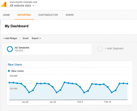 If you don’t know the answer to these questions, it’s time to get familiar with Google Analytics and heat mapping!
Google Analytics is one of the most popular ways to monitor your website performance and track users. If you haven’t added Google Analytics or a similar tool to your site yet, wait no longer! It’s simple to do and will offer you great insight into what is performing well and what is not performing so well.
Heat maps are another tool marketers use to monitor users’ behavior. Heat maps offer a visual representation of where users are clicking on your site. Most heat mapping software/apps give you a view of the desired page you wish to learn more about with an overlaid visual average of where users are clicking most.
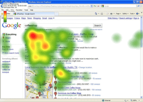 Scrolling heat maps tell you, on average, how far your users are scrolling down the page once they arrive. This can give you a good indication as to when and where you’re losing users. Are your users getting to your footer to register for your newsletters or bouncing half way down the page? Are your users leaving the hero to learn more about your product, never making it past the fold? If so, are they clicking on a product page or bouncing from your site altogether?
While there are many heat mapping tools on the market, Crazy Egg and Hotjar are two of the most popular.
Once you figure out your user behavior you can adjust your conversion strategies appropriately. And if you are redesigning your website, you will have valuable user data from which to inform your design.
SIGN #2 – It’s 2017 and Your Site is Still Not Responsive.
Just kidding, no shame here. We won’t judge! But we strongly encourage you to get a responsive site!
The fact is that mobile usage is quickly outgrowing desktop usage or at the very least is on par. As users surf the web on mobile devices and tablets, it is no longer acceptable to have a site that isn’t viewable or provides a poor user experience on a mobile device.
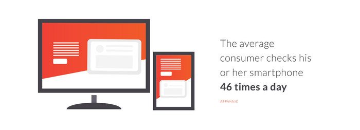
“The average consumer checks his or her smartphone 46 times a day, and in the US, people do this a collective 8 billion times every 24 hours,” according to Appannie.
If you aren’t setup to display your content in a readable way on mobile devices then you are missing out on over 50% of your user base at any given time.
SIGN #3 – Your Website Looks Like a Throwback to 1999.
Your website is often the first impression people have of your business. Would you let dirt collect on your windows? Would you let the paint chip off? How about that door handle that people can never open?
Have you compared your site to your competitors lately? Do you get a feeling of intense anxiety thinking about it? Let’s face it, markets these days are incredibly competitive and when combined with the fast paced, ever changing landscape of the web it can be easy to find yourself left behind, toting a website that looks like it hasn’t been touched since 1999 (even if you just built it five years ago). The good news is (if you find yourself in this situation) there is never a better time for a redesign than now!
SIGN #4 – Your Website or Webpages Take More Than Three Seconds to Load
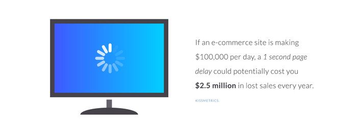
In 2017 Kissmetrics reported that if an e-commerce site is making $100,000 per day, a 1-second page delay could potentially cost $2.5 million in lost sales every year.
That’s because 40% of users will ABANDON your website if it takes more than three seconds to load! Fact is, users are becoming more accustomed to instant gratification and your brand better be able to deliver or face high abandonment rates.
If a site takes longer than three seconds to load the user loses trust in your brand and will most likely do business elsewhere. After all, the competitors are only a click away.
Redesigns are not only about making the website “look better,” they are about helping you convert visitors into customers. While a beautifully designed website is great, without function, form just becomes an obstacle. When redesigning a website make sure you are spending just as much time focused on user experience and functionality as you are on the aesthetic of your site.
Still not sure if you need a new website? Vital can help!
Let us take a look and perform a quick audit of your site. We’ll give you our honest opinion on what your sites got going for it and where it could use some improvement. If it’s got nothing good going on, we’ll put it to you gently and then show you how great your website could truly be.

