Chinburg Properties
Chinburg Properties | Brand Strategy
Scope
Challenge:
Creating a Unified Brand Architecture for a Full Service Real Estate Firm
Often, it’s the most successful businesses that lack a strong brand strategy. When a company grows quickly, acquiring other brands and adding services, there isn’t always time to devote to brand architecture resulting in a disjointed house of brands that do not harness or build brand equity. As a result, many thriving businesses find that they need to implement brand architecture on an existing portfolio of brands. This was the challenge Chinburg Properties of Newmarket, NH, brought to Vital Design. 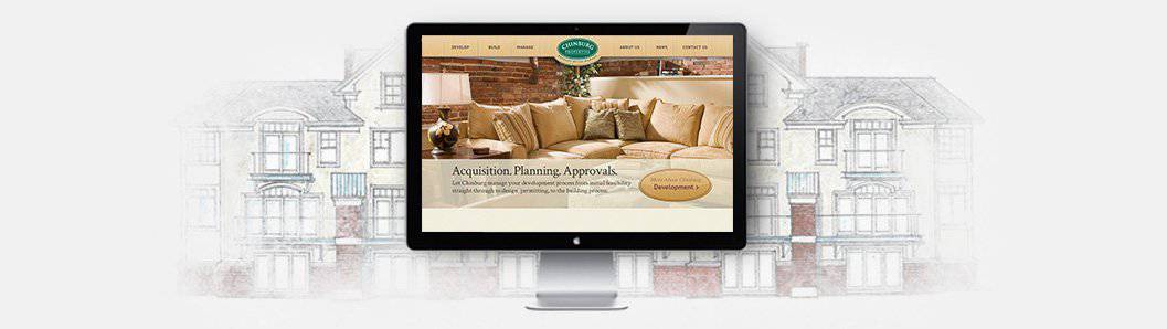 Chinburg Properties is a full service real estate firm that manages several restored mill buildings around the NH Seacoast, each with their own brand identity and logo designs. Before this branding project, their management arm was Great Mills Properties, which had its own logo and branding. Chinburg is also a highly recognized builder and developer of single-family homes and restorer of some of NH’s most recognizable mills. The building and development sector of the company was known as Chinburg Builders and had the most recognizable logo and brand. As a result of this fractured brand strategy, Chinburg Builders was not benefitting from brand equity of the mill properties or the increasingly more visible management company and vice versa. The challenge of this project was to extend the brand equity of the Chinburg Builders name to all of the company’s brands, without compromising the brand equity and rich local history of Chinburg’s established rental properties.
Solution:
Rearrange Brand Architecture to Maximize Brand Equity
Phase 1: Create a New Brand Architecture Before starting the design process, Vital conducted extensive research into brand architecture for real estate firms, and presented Chinburg with three possible options. 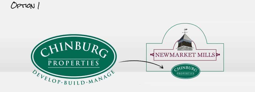 The first option eliminates the Great Mills Properties brand, and brings all Chinburg brands, including Chinburg Builders, under the parent brand of Chinburg Properties. The Chinburg Properties logo design will be used to endorse the Mill Properties, keeping the uniqueness of the mills while extending the equity of Chinburg. This was Vital’s recommendation, as it is cost-effective, flexible and intuitively architected.
 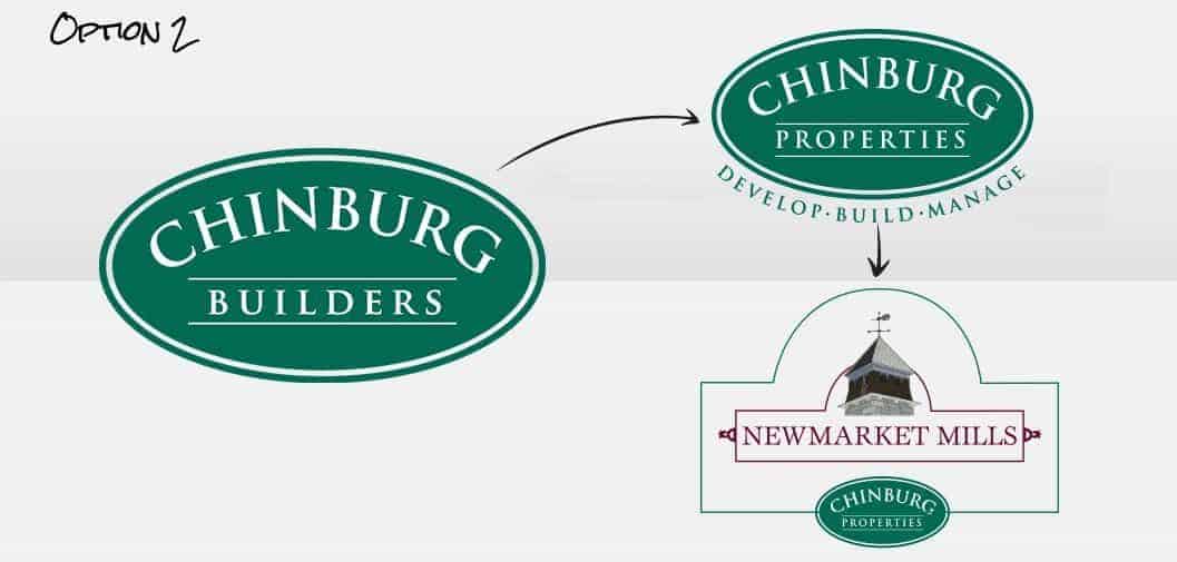 This option maintains the Chinburg Builders brand for the building/development sector of the company. It eliminates the Great Mills Properties brand and it creates a new property management brand, Chinburg Properties, which endorses all of the mill properties. This solution although effective at extending brand equity embraces more moving parts which would come at an increased cost.
 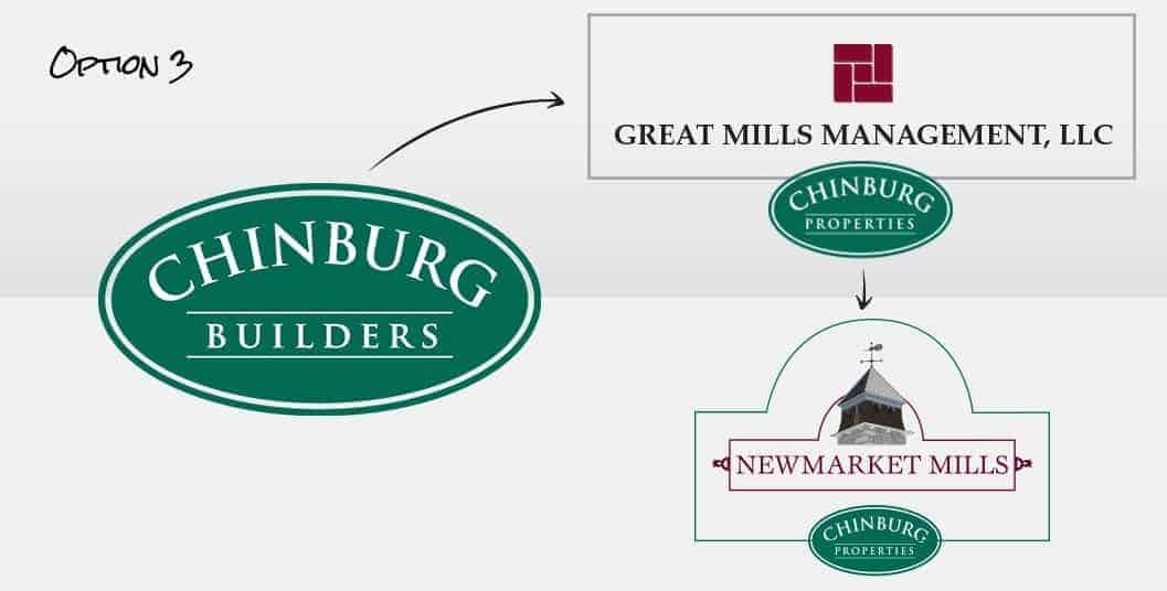 The final option keeps Chinburg Builders and Great Mills Properties, and uses Chinburg Properties as the endorsing brand of Great Mills Properties, which would then endorse each mill property. This is both the most complicated and most expensive option. Chinburg selected Vital’s original recommendation, Option 1. Vital’s brand architecture strategy unified and streamlined Chinburg’s business segments by creating the umbrella brand of Chinburg Properties, revitalizing the existing Chinburg logo, and eliminating the Great Mills Properties brand from the equation. To ensure the newly-unified Chinburg Properties logo clearly communicates the company’s full range of services, Vital added the tagline “Develop • Build • Manage”.
 ![]() Phase 2: Brand Mill Properties To bring the company’s managed mill properties under the Chinburg Properties parent brand, Vital developed a wrapper concept to tie the properties together while allowing each to maintain its own unique logo. The mill property logos are able to maintain precedence and their unique brand characters, and the Chinburg logo takes a subservient position. To preserve the brand equity of the individual mills, Vital maintained most of the original branding. However, some of the existing logos had a background color, some did not; and some had a pictorial icon while others did not. To unify them, Vital created containers for each logo, and added icons to the logos that formerly were only script. These containers are endorsed by the Chinburg name in an oval, in a complementary color.
Phase 2: Brand Mill Properties To bring the company’s managed mill properties under the Chinburg Properties parent brand, Vital developed a wrapper concept to tie the properties together while allowing each to maintain its own unique logo. The mill property logos are able to maintain precedence and their unique brand characters, and the Chinburg logo takes a subservient position. To preserve the brand equity of the individual mills, Vital maintained most of the original branding. However, some of the existing logos had a background color, some did not; and some had a pictorial icon while others did not. To unify them, Vital created containers for each logo, and added icons to the logos that formerly were only script. These containers are endorsed by the Chinburg name in an oval, in a complementary color. ![]() The Chinburg endorsement on the mill logos does not use the deep green color or the full Chinburg Properties name, but the brand equity is preserved in the Chinburg name and the distinctive oval. The new brand architecture extends the Chinburg name to all of the company’s holdings, while preserving the brand equity and rich local history of the individual rental properties. This hybrid brand architecture establishes a scalable brand identity that can be applied to properties Chinburg acquires or develops in the future.
The Chinburg endorsement on the mill logos does not use the deep green color or the full Chinburg Properties name, but the brand equity is preserved in the Chinburg name and the distinctive oval. The new brand architecture extends the Chinburg name to all of the company’s holdings, while preserving the brand equity and rich local history of the individual rental properties. This hybrid brand architecture establishes a scalable brand identity that can be applied to properties Chinburg acquires or develops in the future.
Related Projects
Ready to Start A Project?
Let’s do this! We can’t wait to hear about what you’ve got planned. Fill out the form below and let’s get started.