4. PLACEMENT
Should your CTA be bold and above the fold, or further down the page at a point more likely to convert? (See our previous blog post on the “above the fold” myth.) A good rule of thumb for CTA placement is, the more complex your product or offer, the lower it should live on your page.
Oversimplified Highest Performer: Below a thorough explanation of value
Why? More likely to convert after making a solid case.
5. DEPTH
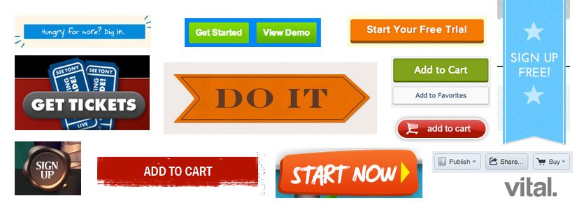
Should your call-to-action buttons be 3-D or flat? There has been a modern trend in flat design, notably with the release of iOS 7, sparking more conversation about flat design versus “skueomorphism,” the design concept of retaining aesthetic elements required in a previous or analog context (such as the 3-D look and feel of a digital “button”). The overall design of your website should always be taken into consideration, but even if the rest of your design is flat, some subtle 3-D effects will make a CTA button stand out—and try experimenting with texture for some additional pizzazz.
Some subtle 3-D effects will make a CTA button stand out.
Oversimplified Highest Performer: Some 3-D elements or texture
Why? It stands out and is easier to see.
6. FONT
Hand-lettering, script, serif or sans serif font? Check out our recent posts on typography for a more in-depth typography talk. Hand lettering and script can be a great way to draw attention to the call-to-action buttons, but for the button itself, a simple, sans serif, bold font choice that is very easy to read and jumps out tends to be the most successful. And avoid excessive font styling, which can make letters and words harder to decipher.
Oversimplified Highest Performer: Contrasting, bold simple font
Why? It’s usually the easiest to see.
7. SUPPORT
Supporting your CTA with arrows or additional lines of text above or below the button can greatly help to further encourage conversion. You want your main button text to be very brief, so you should optimize the area surrounding the button, where you can be more specific and further reinforce the value behind converting.
Oversimplified Highest Performer: Arrow, additional line of text.
Why? It reinforces and encourages conversion.
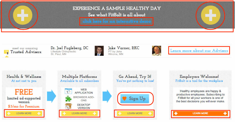
No matter what you decide to do, have fun experimenting with different sizes, shapes and colors. Many sites (such as FitBolt) successfully utilize various shapes, sizes, colors and design options for their CTAs. Test out different CTA versions with A/B testing and see what options perform better under the same circumstances.
Have questions about CTAs? Please share them in the comments below, or tweet them at us!
Stay tuned for our piece on effective CTA copy, and in the meantime, read our post on using testimonials to increase conversions.


![How to Make a Content Style Guide as Unique as Your Brand [w/ Free Template!] 8 content-style-guide](https://vitaldesign.com/wp-content/uploads/2018/05/content-style-guide-818x596.jpg)