No, Vital Design’s blog is not on the cutting room floor. And it hasn’t been censored.
We’ve just been a bit busy the past two months designing, laying out, programming, writing, tweeting, conducting public relations and procuring print for the New Hampshire Film Festival.
Vital has been fortunate to be NHFF’s exclusive marketing partner since 2004 when the fest moved to Portsmouth, NH. We put a lot of time, energy, and creativity (not to mention sleep deprivation) into NHFF. It’s a blockbuster project for us.
We start designing brand elements by January and work on it when we can until we really ramp up around August. A lot of the content we use, such as film titles, panelists, and venues, is not available until a few weeks before the fest. That means we spend a lot of September and October working late, without stunt doubles.
But it was worth it last weekend, when NHFF had its most successful year to date, drawing nearly 9,000 people (up from 6,000 in ’08). Now that we’ve caught up on our sleep, it’s a good time to discuss how NHFF’s design has evolved and improved the past six years. In that time, ten designers have contributed. One constant has been Art Director Scott O. Holt III.
When the fest started, it was known as the New Hampshire Film Expo. In those NHFX days, marketing collateral included a logo, a poster, ads, and passes. In 2009, our marketing to-dos included a website, public relations, large banners, national advertising, email marketing, a 68-page program, t-shirts, a printed and online schedule, tote bags, and social media marketing.
2003
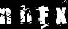
Although we did not design this, it’s the oldest logo we have on file and the version that was being used when we took over the project.
2004
We were concerned that the 2003 logo looked too similar to branding at the time for Boston alternative radio station WFNX. So we cut the grunge factor and adapted for the screen with clean typography.

2005
We modified the logo slightly by using an image from a film countdown shot.

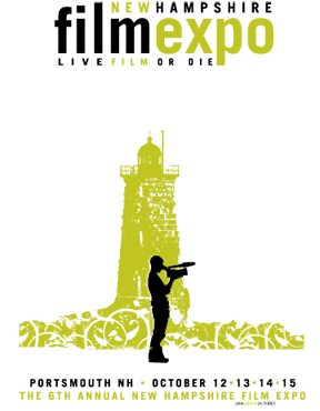
2006
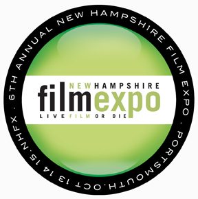
The logo was updated with a 3D lens in the Web 2.0 style that was just becoming popular. In 2006 we also took on the festival program for the first time. The cover is one of the key marketing pieces, since all festival attendees will pick up a program at some point during the weekend. We branched out into larger graphics and added local interest with the lighthouse.
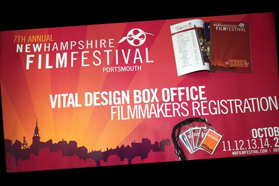
2007
This was the year the expo grew up and became a full-fledged festival. We switched over to a fall palette and introduced the new logo with the reel and seagull. We flushed out the branding with the striking silhouette of the Portsmouth skyline. The classic ’07 look is still a favorite among some involved with the festival.
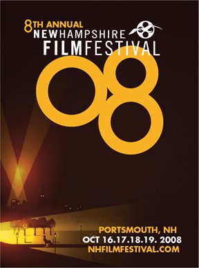
2008
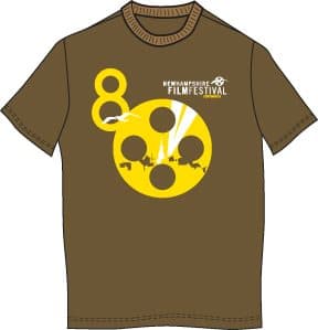
In ’08 we continued with the fall colors and skyline, but added the contemplative festival-goer reflecting on a recent screening in Prescott Park. We introduced the eye-catching ’08. The ’08 T-shirts were the best yet!
2009
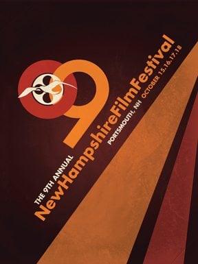
This year we added some visual interest with the angled typography, interlocking ’09 logo, and diagonal stripes. The background texture
and color combination give everything a warm retro feel and continues in the appropriately New England autumn color palette.

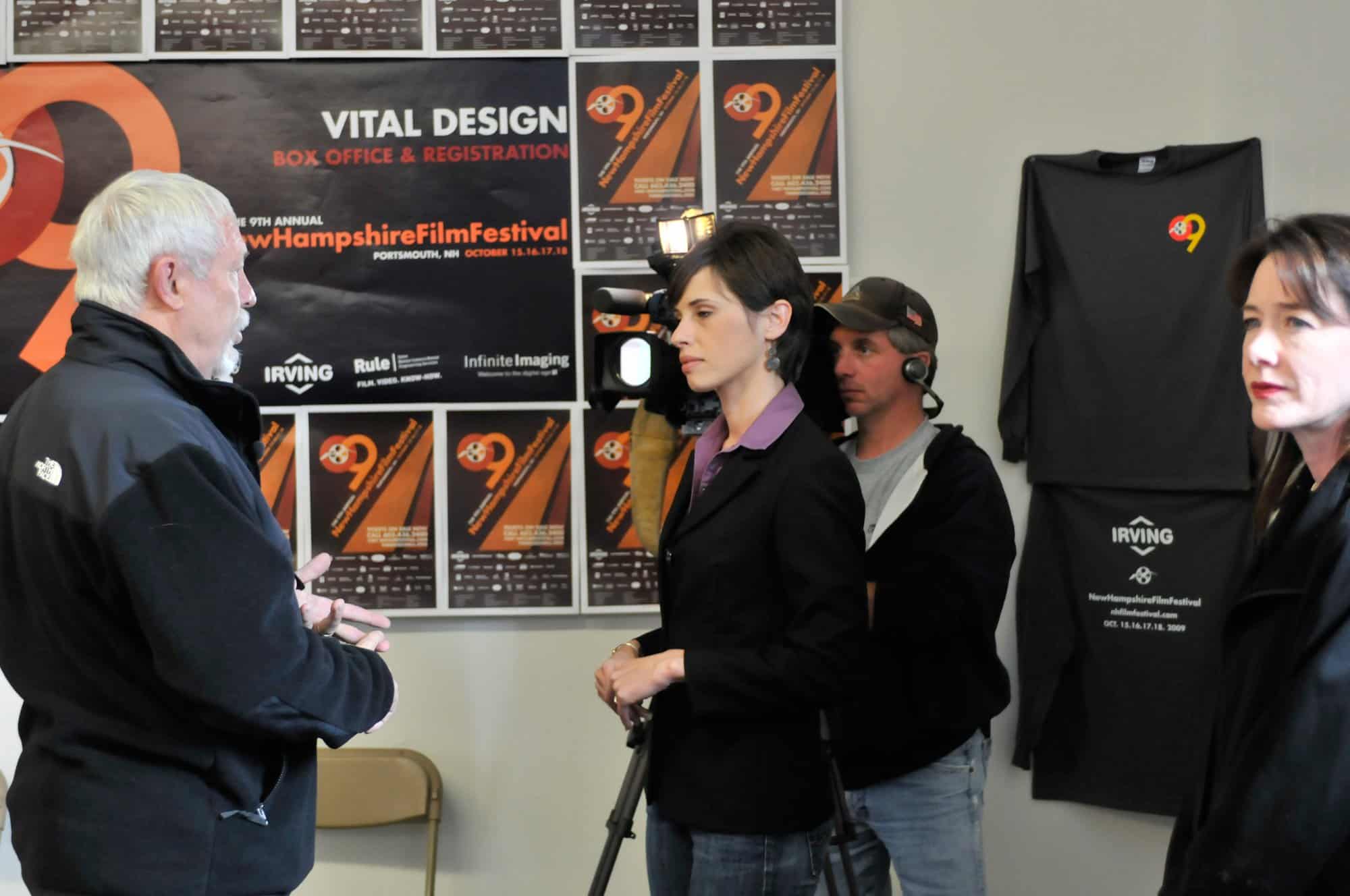
And check out our design in action! What a shot! Award-winning Producer and Director Chase Bailey, left, is interviewed by NECN’s Lauren Collins. At right is Actress Ann Cusack, star of Chase’s film “Crooked Lane” which won Chase this year’s NH Filmmaker of the Year Granny Award. Oh, is that Vital Design listed on that poster? Nice! And check out those T-shirts!
