If you’ve seen one graduate program landing page, it can feel as though you’ve seen them all.
Despite the fact that these pages are often the first conversion opportunity, many universities treat them as a series of check boxes — a headline, a hero, a brief description of the program, and a short ‘Request for Information’ form to fill out — causing them to miss the mark in critical ways that affect inquiry volume, lead quality, and, ultimately, enrollments.
We took a closer look at the paid landing pages for graduate degree programs at 50 top universities across the U.S. to better understand what these institutions do well, where there’s room for improvement, and what you can learn from them. By applying these insights to your own institution’s landing pages, you can take advantage of missed opportunities and ensure your university stands out in a sea of the same.
Before you jump in, be sure to download the full dataset so you can follow along.
University Landing Page Quick Hits
Don’t have time to read our full report? Not to worry — here’s the quick summary you need:
- 74% of landing pages remove global navigation, which tells us most universities know to remove exit points on a key conversion page.
- 88% of pages don’t include internal navigation. That means users, especially on mobile, are left to scroll (and scroll) without clear shortcuts.
- 92% of pages include a strong primary CTA, making it obvious what prospective students should do next…
- …But only 35% of those CTAs appear above the fold. In other words, most students have to scroll before they can act.
- Multi-step forms show up on ⅓ of large public university pages. That’s a lot of unnecessary friction for prospects who are ready to convert.
- Just 42% of pages use social proof. Testimonials, class sizes, and acceptance rates are often left out, despite being easy trust builders.
- Similarly, only 46% of pages mention rankings or awards, leaving credibility builders sitting on the bench.
- Program length is listed on just 52% of pages, which means nearly half of universities leave prospective students guessing how long their degree will take.
- Tuition is mentioned on just 16% of pages — a huge miss for cost-conscious prospects.
- Likewise, only 16% of pages talk about scholarships — even fewer explain how those scholarships impact overall cost.
- Only 14% of pages reference financial aid. One of the most important decision factors for prospective students isn’t getting the airtime it deserves.
- Of the 8 pages that mention scholarships, only 6 mention tuition. Without both, students can’t gauge actual affordability.
- Just 6% of pages show program duration and credit transfer options side-by-side. That’s a lack of critical context for transfer students and working professionals.
- 22% of pages use video, which goes to show this is a powerful storytelling tool not enough universities are taking advantage of.
- 1 in 4 pages scored below a 6 on mobile UX, meaning there’s plenty of room for improvement across the board.
- There’s a negative correlation (-0.12) between form length and mobile UX. Translation? The longer the form, the harder it is to use on a phone.
1. Navigation That Nudges (or Loses) Prospects
Our study revealed that 74% of pages ditch global navigation. It’s a smart move, one that keeps visitors focused and reduces bounce risk by removing escape hatches and nudging them toward filling out the form.
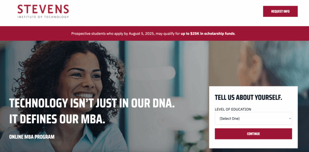
But here’s where things start to fall apart. A full 88% of those same pages don’t help users navigate within the page itself. That means no sticky nav, no anchor links, and no clear page structure. Without this internal navigation, scroll-heavy pages can feel disjointed, especially for mobile users.
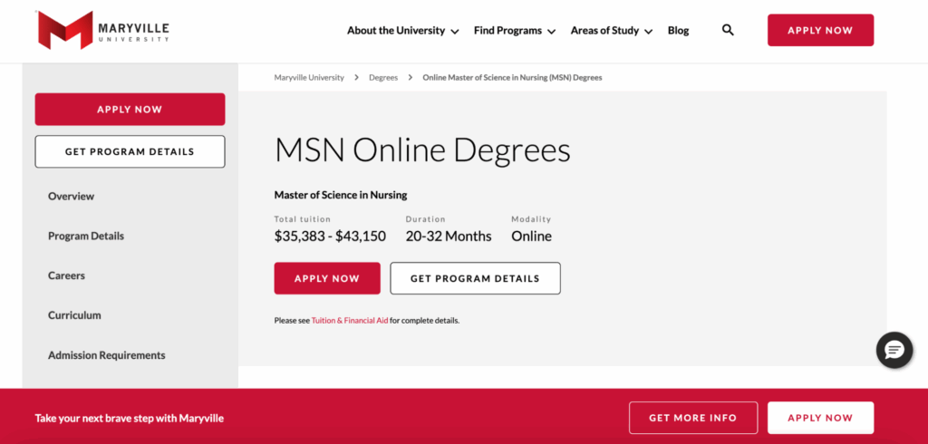
The truth is, very few prospective students will read every word on your landing page. The Nielsen Norman Group first reported in 1997 that 79% of web users scan sites; that’s even more true in the age of social media and shorter attention spans. Visitors to your landing page are looking for visual cues that clearly tell them which sections have the answers they need. When those cues are missing, they’re more likely to bounce.
Here’s what to do instead:
- Remember, structure is strategy. Use modular content blocks that mirror prospective students’ decision-making journey, such as ‘About the Program,’ ‘Who It’s For,’ ‘Career Outcomes,’ and ‘Next Steps.’ These aren’t just tidy headers, they’re guide posts to help visitors navigate your page and find the exact information they need, before they lose focus.
- Support exploration without distraction. Implement in-page navigation or sticky headers to help prospective students orient themselves, especially on long-form landing pages.
- Guide toward action. A visual hierarchy with bold headlines, consistent section layouts, repeated calls-to-action (CTAs), and just enough white space to prevent your page from feeling cluttered will ensure key messages and next steps are always within reach, no matter when a prospective student drops in.
- Design for decision-stage visitors. Your landing page should answer these three questions with no exceptions:
- ‘Is this program for me?’
- ‘Can I afford it?’
- ‘What happens next?’
If you don’t answer these questions clearly and confidently, you risk losing best-fit prospects to a competitor who does.
2. Conversion-hungry CTAs Are Getting in Their Own Way
Most of the university landing pages we looked at aren’t shy about what they want users to do. The vast majority (92%) have a clear primary CTA, such as ‘Request Info’ or ‘Download Brochure.’ Even better, 35% place that CTA above the fold — the part of the webpage that appears before you scroll — so prospective students can take immediate action.
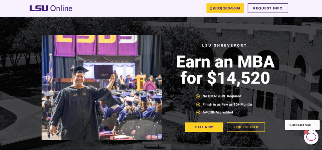
Don’t assume one CTA at the top of the page is enough. Users engage with content at different speeds. Some want to read alumni testimonials, others are more interested in program outcomes. Reinforce your CTAs at natural conversion points throughout the page. Below the curriculum breakdown, below scholarship information…and so on and so forth. The goal isn’t just visibility, it’s timing. You want your CTA to appear as soon as prospective students think, ‘OK, I’m in. What’s next?’
3. Multi-Step Forms: Misunderstood, But Often More Effective
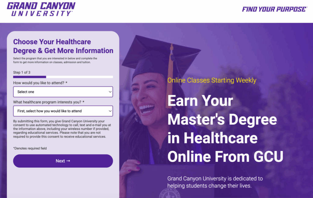
According to our research, 70% of landing pages include five or more fields, and 26% use multi-step forms. At first glance, that might seem like a risky move — after all, conventional wisdom says more steps create more friction.
But recent data tells a more nuanced story.
According to a study by Conversion Rate Experts, multi-step forms can increase conversion rates when designed thoughtfully. By breaking complex or intimidating questions into digestible steps, these forms can reduce cognitive load and guide users through the process more intuitively. This may help explain why many high-performing institutions lean into multi-step structures, especially when they’re focused on lead quality, not just volume.
That said, execution is everything. Long, clunky forms that aren’t mobile-friendly or don’t show progress indicators will still drive users away.
4. Overlooking Value Signals That Drive Conversion
Earning a graduate degree isn’t cheap. Whether it’s a $60k MBA or a certificate program that runs a few grand, prospective students want to know: Is this worth it?
That’s why it’s surprising that fewer than half of the university landing pages in our study include value levers. Only 42% feature social proof such as class size, acceptance rates, or testimonials, and just 46% include awards, school rankings, or third-party recognition. Those are a lot of missed opportunities.
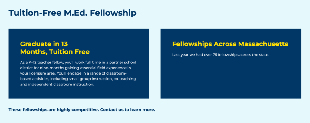

When a prospect lands on your page, they aren’t just comparing your program to another institution’s. They’re weighing it against bootcamps, certificate programs, or even staying put in their current job. If you’re asking them to invest significant time and money, you have to make your case quickly.
That means putting your value signals front and center:
- Show prospective students proof early with eye-catching statistics like ‘93% post-graduation employment rate’ or ‘5,000+ alumni worldwide.’
- Add badges for rankings or accreditation.
- Highlight student testimonials by weaving into the story of your program’s impact.
If you’re marketing a high-cost, high-touch program, displaying value proof is non-negotiable. You’re not just selling a degree, you’re selling a future, so make sure your landing page speaks to ROI, career advancement, and employer demand — all the things your prospects are trying to justify.
5. Missing Core Program Info = Missed Leads
You’d think information about the time and financial investment required would be table stakes on a graduate program landing page. But, according to our review, just 52% of pages mention program duration. Even fewer list tuition (16%), scholarships (16%), or financial aid (14%).
Even worse, many universities link out to a separate financial aid or tuition page, effectively asking prospective students to leave the landing page right before they’re supposed to convert.

The mid-career professionals applying to your program are making fast, high-stakes decisions. They’ve got jobs, families, and maybe a few tabs open comparing your university to three others. They don’t want to dig through your site to figure out whether your program fits their life and budget, so make it easy for them by being up front about time and cost. Use clear, skimmable blocks that say things like ‘Complete your degree in 12–18 months’ or ‘$24,000 total tuition (financial aid available).’
If you’re worried about sticker shock, don’t hide from it. Instead, frame cost in terms of ROI; for example, ‘average salary increase of 22% within 1 year post-grad’ or ‘loan repayment support available.’ And don’t bury this information in a downloadable PDF. Whether it’s toggle sections or visual cards, create a clean, accessible layout that answers prospective students’ questions without making them feel as though they’re flipping through a course catalog.
Remember: Transparency builds trust, and trust leads to conversions.
6. Scholarship Mentions Fall Flat Without Clear Tuition Info
Remember how we said just 16% pages included scholarship info? That’s 8 pages in total — and only 6 of them mentioned both scholarships and tuition. Yikes.
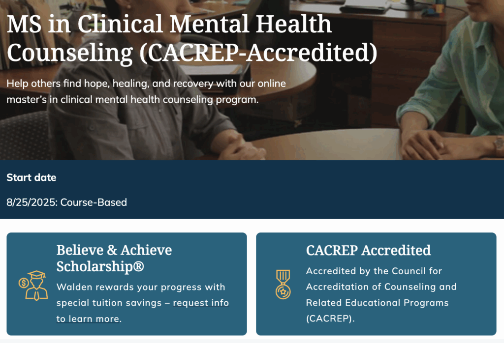
The truth is, scholarships lose much of their impact if prospective students don’t know the baseline costs they offset. Without context, prospects might feel confused, frustrated, or even skeptical about the real affordability of your program. Mixed messaging can kill your credibility and push potential students to look elsewhere.
Whenever you talk about scholarships, pair it with transparent tuition and aid details on the very same page. Think clear, concise summary boxes, like so:
| TUITION $XX,XXX | SCHOLARSHIPS AVAILABLE Up to $X,XXX | FINANCIAL AID Available |
Present scholarships as an integral part of your complete, transparent financial package, not just as standalone perks. Doing so sends a clear message: You’re upfront, honest, and genuinely committed to helping students manage their costs.
7. Transfer Students Need Clarity (That Universities Aren’t Providing)
Only 6% of the landing pages we surveyed — that’s three out of 50 — clearly display both credit transfer options and program duration. For working adults, transfer students, or anyone trying to accelerate their studies, knowing these two key pieces of information upfront is a must-have, not a nice-to-have.
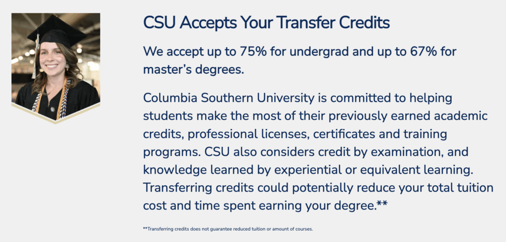
Think about it from their perspective. These students are juggling busy lives and careers and may have previous credit they want to put to good use. They want immediate clarity on how quickly they can complete their degree, and how their prior coursework will count. Failing to provide these answers together means potentially losing their interest (and their applications) to competitors who do.
Here’s your action plan: Create a dedicated, easily visible spot on your landing page, such as an eye-catching callout or an FAQ, that highlights both duration and transfer opportunities clearly and succinctly. A simple statement like, ‘Complete your degree in as little as 12 months and transfer up to 12 credits’ can make all the difference. Keep an eye on competitor pages, too, to ensure yours is always the clearest and most comprehensive option out there.
8. Engagement Features Lag Behind Modern Expectations
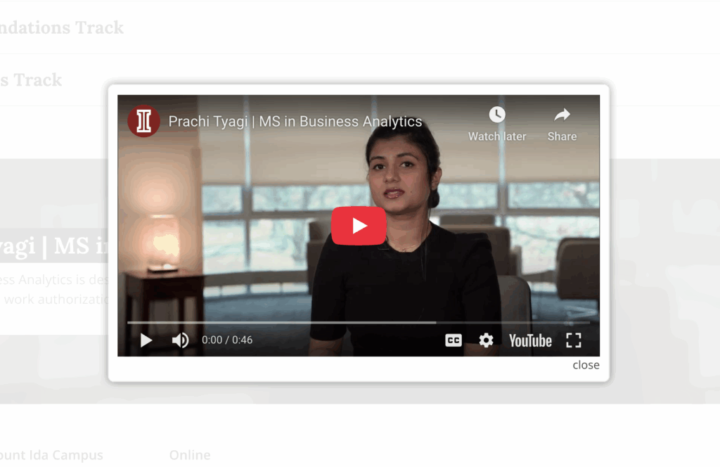
Let’s talk about engagement — or the lack of it. Only 22% of the landing pages in our study include video. That’s a head-scratcher, considering video is one of the most powerful tools at universities’ disposal for sparking an emotional connection and setting their program apart. A short student story, 30-second faculty welcome, or a brand anthem video can do more than three paragraphs of copy ever could.
And then there’s mobile. Mobile user experience (UX) scores across all 50 pages ranged from less-than-impressive 3 to a highly coveted 10, with an average just shy of 7. A quarter of pages scored below a 6. That means the mobile experience for a significant portion of pages were disappointing due to slow load times, hard-to-find CTAs, endless walls of text, and more.
In a world where nearly 62% of website traffic comes from mobile devices, that’s a problem. Prospective students are more likely to visit your program’s landing page from their phone than a desktop or laptop computer. Whether they do so during a break from work, on their daily commute, or from the comfort of their couch, they aren’t going to patiently resize your layout or zoom in to click a CTA.
To avoid any issues:
- Design mobile-first. Test every page, every form, and every toggle on a real phone, not just a preview pane.
- Don’t skip the video. You don’t need a full-blown cinematic masterpiece. A student spotlight, faculty intro, or virtual classroom walkthrough can build credibility and connection just as well.
- Format matters. Big blocks of texts are often a dead end. Instead, use modular layouts, bold headers, bullet points, and content blocks that guide the eye and invite scrolling.
9. Every Extra Form Field Hurts Mobile UX (And Leads)
Now, let’s look at how form length impacts mobile users. Our research uncovered a meaningful negative correlation (-0.12) between the number of fields in a form and the overall mobile UX score. Translation: The longer your form, the more frustrating it is for users to complete it on their phones.
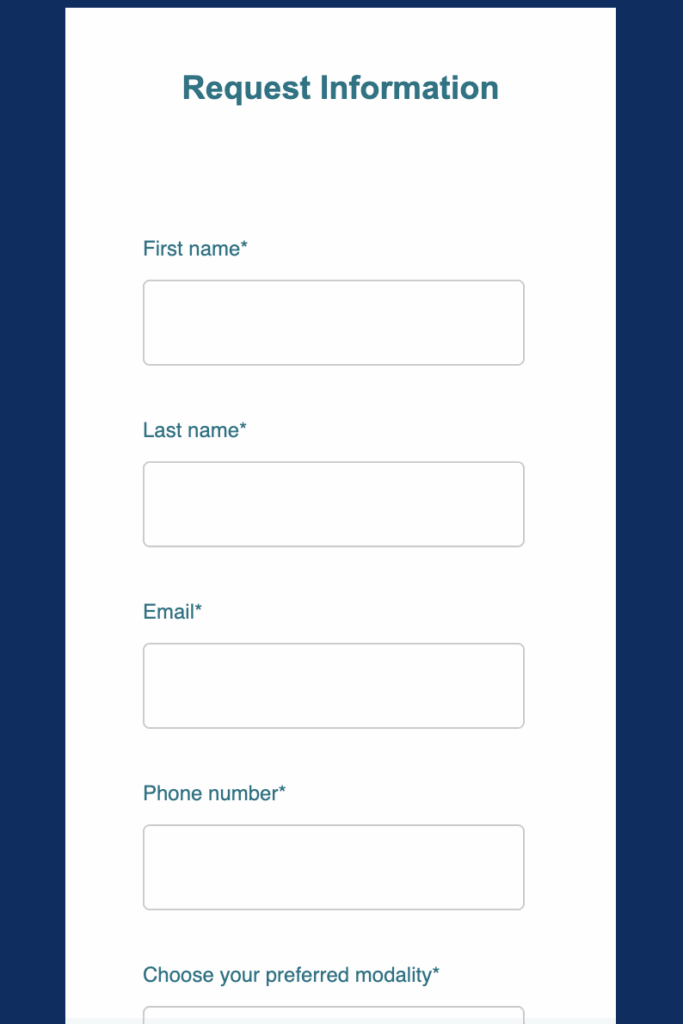
Considering that most prospective grad students will interact with your institution’s website via mobile at some point, this is more than an inconvenience, it’s a potential dealbreaker. Lengthy forms can be cumbersome, slow down the interaction, and even lead potential students to abandon your landing page altogether. And let’s face it, losing prospects at this critical point in their enrollment journey is a conversion nightmare.
To get ahead of this issue, start by auditing your current forms. Look critically at every single field and ask yourself, is this essential? Can we capture this information later, perhaps in a follow-up interaction? Or, instead, could we reformat this as a multi-step form so that it takes up less space on the page? The goal here is to streamline your approach so it looks just as good on mobile as it does on desktop.
As an added bonus, try implementing conditional logic in your forms. This way, additional questions only appear after the initial submission, dramatically simplifying that crucial first step. And, above all, make it a habit to regularly test your forms on actual mobile devices (and not just the preview mode). Real-life tests often reveal friction points you’d never notice otherwise.
Best Practices for High-converting Higher Ed Landing Pages
Not every issue or opportunity we saw during this study was tied to a specific stat. Some patterns were just too consistent to ignore — small things that, when handled well, can have a major impact on how your page performs.
If you’re building or optimizing a graduate program landing page, here’s what we recommend:
- Use Objection Mapping to Preempt Drop-Off – Identify top student hesitations (cost, flexibility, ROI) and counter them directly in your landing page copy. A simple objection/response chart helps align messaging and reduce friction, so prospects keep moving forward.
- Keep CTAs in sight, always. Don’t make prospective students hunt for your primary CTA. Place your ‘Request Info’ or ‘Apply Now’ CTA above the fold and repeat it throughout the page. Sticky or persistent CTAs are great for long-scroll pages. Just make sure they’re mobile-friendly and don’t block important content.
- Use video to increase conversion rate. Want to build trust quickly? Put a face to your program. Pages with video hold attention 1.4x longer, so use that to your advantage. Whether it’s a student testimonial or a program overview, a short, 60-second video can increase emotional engagement and help prospective students see themselves in your graduate degree program.
- Balance clarity with concision. Prospective students are scanning, not studying. Use short paragraphs, clear section headers, and modular layouts to highlight what matters. Got a lot to say? Use accordions, tabs, or other interactive formats to keep the page skimmable.
- Design for your audience’s priorities, not just your own. Scenic campus photos and information about student life might hook undergrads, but adult learners or working professionals? Not so much. Instead, focus on program flexibility, career outcomes, financial aid, and ROI. Know what your audience cares about, and let that shape your content hierarchy.
- Create urgency with time-sensitive details. Deadlines convert. Highlight start dates, application cutoffs, or limited seats early and often and pair them with CTAs like ‘Apply by July 15 to secure your spot’ to incentivize action without sounding pushy.
- Aim for the ‘Goldilocks’ zone of content. Too little information leaves prospects uncertain, while too much can overwhelm them. In either case, you risk page visitors bouncing before they take action. Target the sweet spot by answering the top three to five questions your ideal student would ask. Want to validate how well your content performs? Consider user testing or heatmaps to see how prospective students interact with your page.
- Design should support, not distract. A sleek design can enhance UX, but over-designed pages often backfire. Avoid heavy animation, awkward layouts, and hard-to-read fonts that add unnecessary friction. A clean and accessible design with intuitive flow makes it easier for prospective students to move from interest to inquiry.
The best best practice of all? Partner with a seasoned higher ed digital marketing agency with a proven track record of creating landing pages that convert. We’re ready to get started when you are — let’s talk.
