At Vital, we’re always looking for ways to sharpen our skills and improve our understanding of what gets results. Conversion is the ultimate goal of our website, so conversion rate optimization (CRO) is something we’re constantly testing. Recently, we started experimenting with ways to increase our email list subscription rate on our blog and website using an exit overlay pop-up.
Using OptinMonster’s WordPress plugin, our overall conversion rate for email subscriptions increased by 97%. We also ran an A/B Test on CTA copy and the results were clear — with the winning copy outperforming the other by a resounding 60%.
Let’s take a look at this CRO case study to learn how we did it.
The Goal: Increase Our Email Subscription Conversion Rate
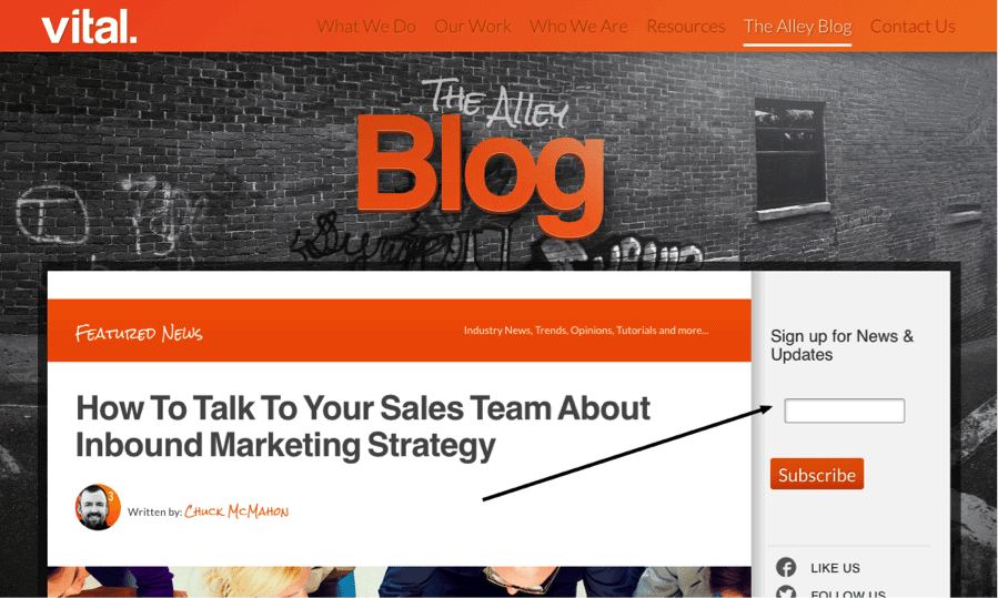
Before we set up this pop-up, we were averaging 2.79 email sign-ups per day. Not great, but certainly fairly steady. All our email signups were coming in through a single email signup CTA on our blog’s sidebar (pictured below).
One of the most effective methods of increasing email conversions, according to many industry leaders, is a pop-up email subscription CTA. We were a little hesitant to put a pop-up on our site because, well, they’re annoying. But the numbers were undeniable. We had to test it for ourselves.
The CRO Tactic: An Exit Overlay Pop-Up Email Subscription CTA
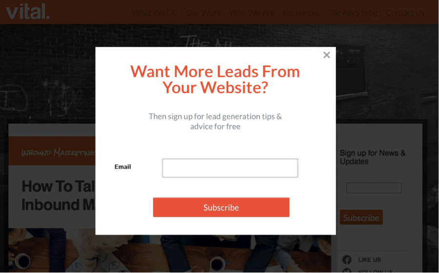
So against the cries of our designers, we decided to test out a pop-up — but not a timed pop-up (where the pop-up box happens after a set amount of time, say 30 seconds) or a scroll-length-triggered pop-up (pop-up happens after you’ve scrolled a certain length down the page). We decided to go with OptinMonster’s Exit Overlay pop-up, which would only pop up when your cursor left the active window, presumably when you were about to back out of the page or navigate elsewhere. It was the least-obtrusive pop-up we could find, while still capturing the attention of each visitor.
The Results: A 97% Increase In Email Subscription Conversion
Once we implemented this pop-up, which averaged to roughly 5.5 conversions per day. 5.5 conversions per day, up from 2.79 per day — a 97% increase in conversions. Which is not too shabby.
The Conclusion: Pop-Ups Increase Email Subscriptions — CRO Success!
Clearly the exit overlay prompt worked. It doubled our conversions for email list subscriptions, and we did not see a decrease in traffic or bounce rate. (The fact that we weren’t hitting people up with the pop-up until they were exiting the site meant that we didn’t have to worry about the pop-up itself prompting a bounce.)
Goal: Find Out Which CTA “Voice” Performs Best
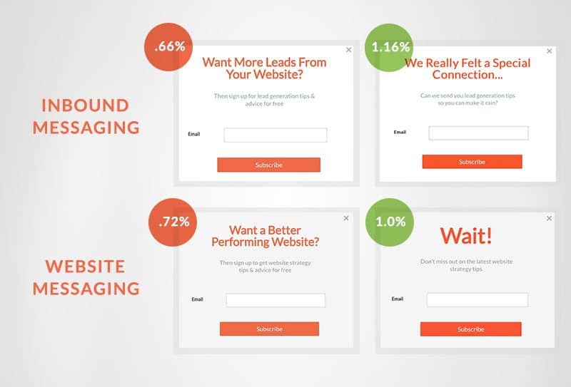
We weren’t just testing out one pop-up CTA — we were testing four. We wanted to find out what kind of voice our audience would respond to. And we also wanted to know if our two main audiences — website design & development services and inbound marketing services — would have different voice preferences.
The CRO Tactic: 4 Separate, Uniquely-Written CTAs
Four CTAs: two different voices, each speaking to one of two audiences.
First, we had our website-related services page visitors served up a CTA in a traditional voice, and a CTA in a more quippy voice — both CTAs encouraging them to sign up for website-related information and tips. Then, we had our inbound-related services page visitors also served up CTAs in a traditional vs. quippy voice, encouraging them to sign up for inbound-related information and tips.
This kind of segmentation is a CRO best practice — optimize as specifically as you can, for as many major audiences as you segment.
The Results: Which CTA Performed Best for Each?
Needless to say, the second version of both, which contained the less traditional, more quippy copy were the distinct winners, beating the more traditional value offer messaging by 28–50%.
The Conclusion: Vital’s Visitors Respond to Unexpected Copy
From this, we concluded that, at least for our visitors, when you catch them off guard with unexpected messaging, they pay more attention. Perhaps they were responding to the humor of these messages. Perhaps the more traditional copy was being perceived as an ad and simply ignored more easily. Either way, this was an important tool for our CRO toolbox — knowing that our conversion rate increases when we use a voice that grabs our audience’s attention.
What’s next?
We are already in the process of refining some new A/B tests to challenge the current winners to see if we can further improve conversion rates. We’re constantly running A/B tests on our own site, and our clients’ sites, and experimenting with various CRO best practices. Their results tell us a lot about what makes a page or element more effective. Optimize, adjust, repeat.
Stay tuned for more results from some of our other CRO experiments — and please let us know what conclusions YOU draw from our results. Do you see something we may have missed? Have a theory of why one method out-performed another? We’d love to hear from you!


