With nearly 4 billion active users each month, Meta products — Facebook, WhatsApp, Instagram, and Messenger — are some of the most popular social media platforms in the world. That means Meta ads are one of the most important channels for graduate and continuing education programs looking to reach working professionals, career-changers, and mission-driven learners.
But, for all their importance, most university marketing teams don’t have the time (or the appetite) to audit what their competitors are actually doing on the platform.
That’s where we come in.
We analyzed Meta ad campaigns from 50 top grad programs across the United States, reviewing each one for its creative format, messaging strategy, calls-to-action, key differentiators, and more. Here’s what we found.
Graduate Program Meta Ad Campaign Quick Hits
While we hope you’ll read the full analysis, we know you’re busy. Here are the highlights from our study if you only have a few minutes to spare:
- 86% of ads rely on the same CTA. “Learn More” is by far the most widely used CTA, which means there’s a wide-open lane for programs willing to test something different.
- Only 10% of ads push prospects directly to apply (“Apply Now”). For high-intent audiences, programs are underutilizing stronger conversion CTAs.
- 98% of ads use a visual asset (mostly photos). Visuals are table stakes, but with only 16% of ads using video, there’s clear room to differentiate with short-form video.
- 70% of ads use stock imagery. Heavy stock photo reliance is a competitive weakness that undercuts authenticity.
- 78% of ads feature people-centric imagery. This is a smart step, as prospects respond more strongly to faces, but there’s an opportunity to feature actual students, faculty, and alumni rather than stock images.
- Only 24% of ads include social proof. That means most competitors are missing out on opportunities to build credibility with prospects.
- Of the ads that include social proof, 50% focus on rankings. 25% feature testimonials, and 25% use outcomes or job market data. Programs should test more graduate success stories and salary/outcome stats to complement rankings and speak directly to ROI-minded prospects.
- 36% of ads highlight career/employment potential as a differentiator. Given that career advancement is the primary decision driver for most grad students, it makes sense that ads lead with outcomes.
- 34% of ads advertise online formats. “100% online” or “online & hybrid” is now a baseline expectation, not a distinct value prop. Grad programs need to go beyond modality and clarify how their online experience is superior.
- 26% of ads promote flexibility as a differentiator. Many programs tout flexibility, but few specify what they mean by that (e.g. asynchronous, evenings, weekends, accelerated pace, multiple locations, and so on).
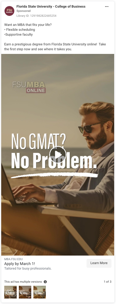
- 12% of ads mention “test option” or “no GMAT or GRE.” For busy, mid-career prospects, not having to prepare for a test is a strong selling point. If your program is test-optional or waives exams for qualified applicants, place that messaging front and center.
- Only 8% of ads include cost-related messaging. In a high-tuition environment, cost transparency and incentives are powerful but underused.
1. The Problem with “Learn More”
“Learn More” appeared as the primary CTA in 86% of the Meta ad campaigns we reviewed, but its ubiquity isn’t the real issue. The problem is that it doesn’t tell prospective students what they’ll actually get when they click. For working professionals juggling time, risk, and uncertainty, ambiguity creates friction. A non-descriptive CTA forces them to guess whether the next page will address their chief concerns: curriculum, cost, outcomes, format, or admissions steps.
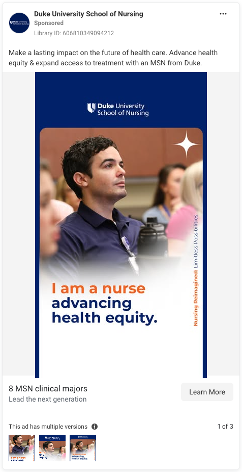
Graduate prospects want clarity, not vague invitations. When your CTA lacks specificity, you unintentionally position your program as one more decision they have to decipher. Programs that use explicit CTAs, such as “Talk to Admissions,” “See Career Outcomes,” or “Download the Program Guide” reduce cognitive load and empower prospects to move confidently into the next step. Even “Apply Now,” which 10% of ads used, is more descriptive than “Learn More.”
Use CTAs that articulate value. “Learn More” can still serve a purpose, but it shouldn’t be the default. Align the CTA with the payoff you’re offering and the intent of the audience you’re targeting.
2. Static Photos Rule the Feed
Let’s start with the good news: 98% of the ads in our study include featured imagery.
The bad news? 76% rely on static photography as their primary creative, while only 16% use video. This runs counter to what user behavior supports. In a feed built for motion, still images struggle to compete with videos, reels, and stories content that capture attention through pacing and visual change.
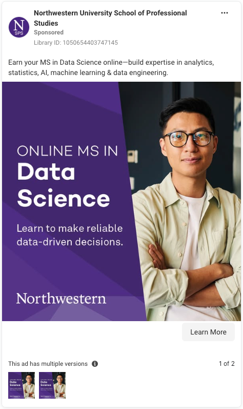
The reliance on photos wouldn’t be an issue if those images delivered strong narrative or program context, but most do not. Many are interchangeable: students with laptops, smiling professionals, and groups in conversation. Without motion or context, ads lack stopping power and meaning. Prospects can’t infer anything about the academic experience, faculty interaction, or the program’s differentiators.
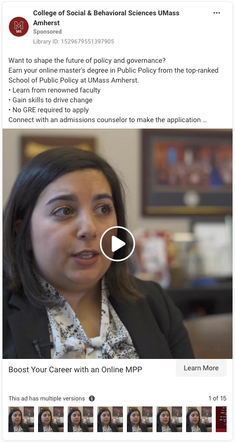
Programs that incorporate simple video — even a 10–15 second clip of a faculty member speaking to camera, students telling their own stories, or animated text highlighting outcomes — have an advantage over those that use static imagery. And don’t sweat production value. While polished videos can elevate your ads, authenticity is the most important thing.
3. Familiar Faces, Limited Storytelling
We’ve talked about this before, but prospects are naturally drawn to and more inclined to engage with faces. That’s good news, given that 78% of the ads we reviewed featured one or more people as their primary visual subject.
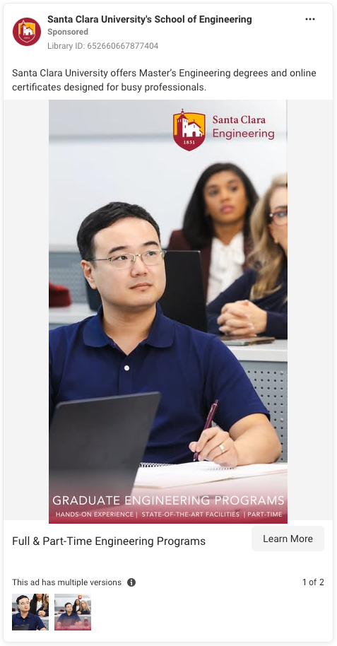
But while human-centered imagery is generally a good instinct, the execution leaves something to be desired. Most of these visuals feel interchangeable: smiling professionals, students at laptops, groups engaged in discussion. they’re so nondescript that they could belong to any program at any institution. When the subject matter doesn’t communicate anything about the academic experience, program identity, or what makes your institution unique, your featured image functions more as wallpaper than signal.
Programs that perform better in the attention economy use visuals that illustrate what it’s actually like to study in this program, such as a nursing student in a simulation lab or a public health student analyzing datasets. These visuals communicate value instantly and help prospects understand the type of work, environment, and outcomes they can expect.
To make a long story short: If you could swap the featured image in your ad with a competitor’s and the message still makes sense, the visual isn’t doing enough work.
4. Stock Imagery Undermines Credibility
The majority (70%) of the Meta ad campaigns included in our review relied on stock photos. It’s easy to understand why, given that stock photos are convenient, polished, and require zero coordination with campus partners. But what you gain in convenience, you sacrifice in credibility.
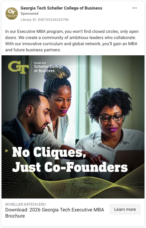
Graduate prospects are making a high-stakes, high-cost decision. When they see that the image representing your program appears generic or overly staged, it signals that your program may be generic, too. More importantly, it disconnects the ad from the real environments, faculty, students, and learning experiences that make your program unique.
Even a small library of real photos can outperform a large library of stock because they create a sense of authenticity and engender an early sense of belonging in prospects, something stock imagery cannot do.
5. Missing in Action: Social Proof
Only 24% of the ads we analyzed include any type of social proof. That’s surprising, given that graduate prospects consistently cite future employment opportunities and academic reputation as driving factors behind their enrollment decisions. Prospects expect universities to make claims about things like flexibility, student success, and faculty support, but without tangible evidence to support these claims, they’re just white noise. Social proof offers something far more persuasive: external validation.
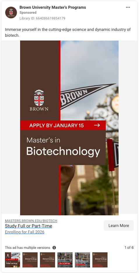
Rankings, alumni testimonials, employment data, student-to-faculty ratios, and so on… These all give prospects the confidence that your institution will actually deliver on the experience you’re promising. And in Meta ads, where attention spans are measured in seconds, a single line of proof can do more heavy lifting than three paragraphs of self-reported messaging.
For your next Meta ad campaign, try highlighting one piece of substantiating evidence in the creative itself, rather than burying it on the landing page. Even a simple “Recognized by X Organization for Y” or “#-Star Student Rating” immediately enhances the credibility of your program.
6. Rankings Are the Most Common Form of Social Proof
Of the programs that did feature social proof, 50% relied on rankings. That makes sense given that rankings are a useful shorthand to build credibility and help prospects differentiate between programs that otherwise appear similar.
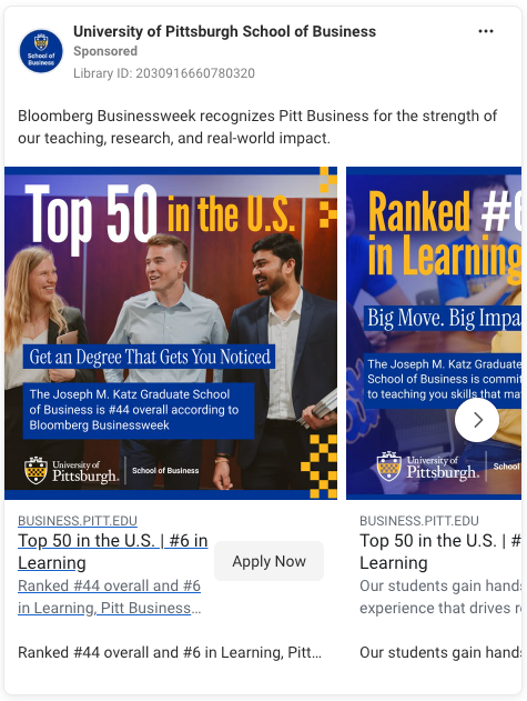
But rankings, while important, can only take you so far because they don’t answer the questions adult learners care about most, such as:
- “Who hires graduates from this program?”
- “What skills will I leave with?”
- “What outcomes can I realistically expect?”
This is where rankings fall short. The strongest Meta ad campaigns pair rankings with student outcomes and student voices. This gives prospects both the reassurance of institutional reputation and evidence that a program delivers on its promises, establishing authority and ROI at the same time.
7. Career Outcomes Appear Less Than Expected
For graduate programs, career advancement is more than a selling point, it’s the entire product. Yet only 36% of ads explicitly highlight outcomes such as promotions, new roles, salary growth, or employer demand. Given that graduate students’ most common reasons for enrolling are to advance in their field, find a stable job, or increase their earnings, this represents a disconnect between what prospects need and what most institutions emphasize.
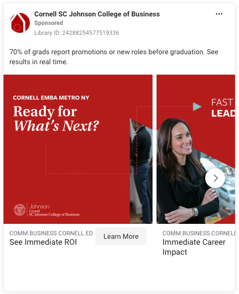
Ads that lead with specific, meaningful outcomes resonate more. For example, Cornell’s claim that “70% of grads report promotions or new roles before graduation” is far more impactful than a generic “Advance your career.” Granular, real-world details help prospects determine whether a program can deliver the return on investment they’re looking for.
8. “Online” Is No Longer a Differentiator, But an Expectation
Online programs have become the norm, as evidenced by the fact that 34% of ads emphasized being online, hybrid, or offering online pathways. Prospects now assume that programs will offer an online option; what they want to know is what the online experience is like.
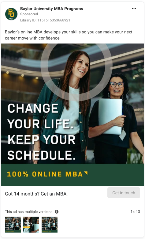
This is where many ads fall short. “100% online” tells prospects where learning happens, but nothing about how. It doesn’t explain how students interact, how faculty teach, how support services function, or how online students build community. When every competitor cites its online format as a differentiator, the messaging stops meaning anything.
Programs that perform better articulate the structure, rhythm, and student support behind the modality. Is it asynchronous? Cohort-based? Faculty-led? These details give prospects the context they need to trust that an online program can actually fit into their life. So shift from talking about modality to talking about experience. Format alone won’t differentiate your program, but online experience will.
9. What Does “Flexibility” Really Mean?
Over a quarter (26%) of ads cited some form of flexibility as a selling point, but most of that messaging was imprecise. “Flexible format,” “Designed for busy professionals,” and “Study on your schedule” all sound nice, but they don’t answer the real question: How, exactly, is this program flexible?
Working professionals aren’t looking for abstract reassurance. They want to know:
- Whether there are rolling start dates
- Whether classes meet at night or on weekends
- Whether coursework is asynchronous
- How many credits they need per term
- How many weeks they have to turn around assignments
- Whether the pacing will work alongside work and family commitments
When the message simply states “flexible,” it places the burden back on the prospect to interpret what that means. The programs that stand out provide concrete structure, so replace general flexibility with specific details.
10. “Top-Ranked” Messaging Is Everywhere
Nearly a quarter (22%) of ads leaned on “top-ranked,” “nationally ranked” or similar recognition. That’s a smart step, since academic reputation is something prospects prioritize when comparing programs and schools. However, institutions that claim top ranking without substantiating that claim undermine their own authority.
For example, Carnegie Mellon’s “#1 Business School for Business Analytics” claim is powerful because it’s attributed to the U.S. News & World Report, one of the most well-known consumer ranking companies. Compare that to Boston College’s uncited claim that it has “A Top-Ranked Grad School of Ed.” The former is trustworthy; the latter is questionable.
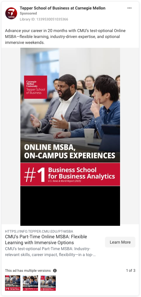
Another note about rankings: They’re a strong differentiator, but shouldn’t be your only differentiator. Prospects want assurance they’re investing in a reputable program, but also want to understand how that reputation will translate to their own outcomes. Use rankings to reinforce your program’s value rather than as a stand-in for it. Connect the recognition to something concrete, such as employer trust, academic rigor, alumni success, or faculty distinction to really make your institution stand out.
11. “Test-Optional” Messaging Is Rare
Just 12% of ads mentioned “no GRE,” “no GMAT,” or “test-optional,” despite test requirements being a major friction point for working professionals balancing jobs, families, and career transitions.
Graduate programs that surface test-optional messaging early in the funnel reduce perceived barriers and widen their pool of qualified prospects. When the requirement (or lack of one) isn’t clearly stated, prospects often assume testing is required and may move on to a competitor that removes that uncertainty. By removing a logistical barrier that disproportionately impacts mid-career adults — a core audience for many professional master’s programs — test-optional messaging drives more inquiries and improves lead quality.
12. Cost-Savings Messages Are Underutilized
Only 8% of ads highlighted cost incentives such as tuition savings, fee waivers, scholarships, or financial support. This is a missed opportunity for institutions, given that budget pressures and financial hesitation are among the most commonly cited barriers for would-be enrollees. Prospective students want to know whether they’ll have support, whether the investment is manageable, and whether your program offers enough flexibility to let them continue working while they study.
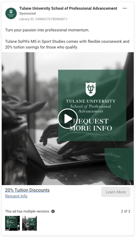
Cost-related messaging doesn’t need to dominate your ads but, when the information exists and is genuinely beneficial, it deserves a place there, not just on the landing page. Think waived application fees, a tuition discount, or employer partnerships. Each of these offerings are a tangible benefit to cost-sensitive prospects, far more so than generic “affordable tuition” messaging.
Best Practices for Stronger Meta Ad Campaigns
Meta ad campaigns can deliver strong results when done right but, as our findings show, there are some key areas where many graduate degree programs miss the mark. Here are some best practices you can implement based on the trends we observed in this study, as well as general insights from across the platform:
- Make your CTAs crystal clear. “Learn More” lacks specificity. If your CTA doesn’t explain what the prospect will get when they click, you risk leaving them with too many unanswered questions. Try CTAs such as “See Career Outcomes,” “Download the Program Guide,” or “Start Your Application” to provide clear expectations and guide prospects toward the next step.
- Leverage video to stand out and engage. Video content grabs attention more effectively and can communicate more information than static imagery. Whether it’s a program overview or a student success story, incorporating video into your ads — even simple, low-budget ones — can improve engagement and increase trust.
- Don’t underestimate the power of social proof. Graduate prospects are skeptical and want proof your program will deliver the outcomes they care about. Incorporate rankings, alumni success stories, and student testimonials to build trust and differentiate your program. If possible, highlight employer partnerships or employment outcomes data to demonstrate the real-world value of your program.
- Be specific about flexibility. Is your program asynchronous? Does it allow for evening classes? Can students select an accelerated track? Giving prospects concrete information about what “flexible” really means will reduce their uncertainty and increase their confidence in choosing your program.
- Highlight ROI upfront. Career advancement is a significant motivator for graduate students, so clearly communicate career outcomes such as promotions, salary increases, or job placements. Use data when possible to show tangible results and set expectations for prospects.
- Incorporate financial benefits when available. As tuition costs rise, prospective students are increasingly concerned about affordability. If your program offers financial assistance, make sure to feature it prominently in your ads. Clear financial messaging can address an immediate objection and encourage prospects to take the next step in the application process.
- Use attention-grabbing imagery that reflects what makes your program unique. Static stock images are prevalent, but they rarely convey the specific experiences that make your program stand out. Instead of generic campus shots or “smiling student” photos, use images that tell a story and reflect what students will actually do in the program.
- Leverage urgency when it aligns with your audience’s goals. Urgency is often a key motivator for prospects who want to reach their next career milestone quickly. If your program can be completed in a short time frame, or if there are deadlines and application windows, make sure to use those to your advantage, since they could spell the difference between a prospect taking immediate action or missing out until the next enrollment cycle.
- Test and iterate. As with any platform, performance is king. Don’t let your ad creative sit idle once it’s live. Regularly review metrics such as click-through rate, conversion rate, and engagement to identify what works and what doesn’t. Testing different variations of CTAs, imagery, or messaging can help you understand what resonates most with your audience, and Meta’s A/B testing functionality makes it easy to continuously improve your campaigns.
The key to successful Meta ad campaigns in higher ed is understanding the unique needs of prospective students and tailoring your approach to meet them. At Vital, we’ve been helping higher ed institutions fine-tune their paid digital media strategies for years, with a sharp focus on data-driven campaigns that convert.
Ready to see your Meta campaigns hit their full potential? Let’s make it happen.

