WordPress powers more of the web than any other content management system — over 40 percent by most counts — and higher education is no exception. Search for the best university websites built on it, though, and you’ll get a library subsite, somebody’s faculty blog, and a roundup nobody has touched in years. A few of those lists still name institutions that left WordPress a long time ago.
So we built our own.
We picked eight that met three tests. Each runs WordPress on its actual marketing homepage, each is well-known enough to be worth measuring, and together they span higher ed, from research flagships to regional publics to a college built for working adults.
We verified every site live on July 8, 2026, then scored each on the six things a marketing director cares most about: user experience, accessibility, branding, load speed, technical site health, and AI search readiness.
Then we ranked them. If you assumed the Ivy League would run the table, this list is going to surprise you.
Key Takeaways
- The homepages that won had one audience. The three top scorers point a prospective student straight at programs, admissions, and cost. The flagships that finished behind them split the same front door among research, news, donors, and current students, which buries what an applicant comes to the page for.
- A recognizable name and a polished site didn’t decide the ranking. Boise State, Park, and Providence out-scored UNC, Harvard, and Washington on the measures a prospective student actually feels.
- Mobile load speed is where every one of the eight has room to gain. Not a single site reached the top band we scored for.
- AI search readiness is table stakes now. All eight scored between 77 and 83 percent, so none of them is shut out of AI answers. The gap shows up in AI visibility, a measure that reflects name recognition more than site quality.
How Did We Score the Sites?
We judged each institution’s primary marketing homepage, the same page we screenshot, against six criteria. The first three take human judgment. The last three come from Google Lighthouse and Semrush, so the numbers hold up from site to site.
- User experience and navigation. The ability of a prospective student to reach programs, admissions, cost and aid, and outcomes fast, with plain labels and an obvious next step.
- Accessibility. Performance against WCAG 2.1 AA expectations, from an automated score plus a manual pass.
- Branding. How well the site sustains a distinct, cohesive identity across templates.
- Load speed. Google Lighthouse performance, mobile profile.
- Site health. Semrush Site Audit technical health, same 100-page crawl cap for every domain.
- AI search health. Semrush’s read on whether AI crawlers can reach, understand, and cite the site, following the framework in our AI-Ready University Website Audit.
One honest note about speed. Lighthouse is a lab test with fixed bands (90 to 100 earns a 5, 50 to 89 earns a 3, under 50 scores a 1), and it’s known for being tough. Providence and Park sit one Lighthouse point apart on either side of a band line, which tells you how much weight a single number deserves. We also pulled Core Web Vitals field data from real users and called out every instance where it disagreed with Lighthouse lab results. When overall scores tied, we gave the edge to user experience, then branding.
One site broke the pattern. Harvard doesn’t run a fixed homepage, so we scored the seasonal feature that was live on the day, and we explain what that costs them when we get there.
What Are the 8 Best University Websites Built on WordPress?
Every site below is confirmed live on WordPress. The order runs from the highest overall score down, and the field is tight, so read the gaps as inches.
1. Boise State University

Platform: WordPress 6.9.4. Verified July 2026.
Overall: 3.67 / 5
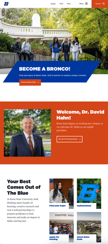
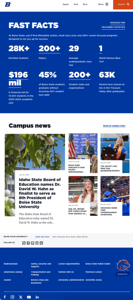
Boise State University runs the tidiest technical build of the eight, and it isn’t the biggest name on the list. Apply, Visit, and Give CTA buttons sit in the global nav, a Find Your Major path is one step in, and a Fast Facts band puts affordability, debt-free graduation, and career numbers on the homepage. The blue-and-orange system runs all the way down to the angled banner on every button. No hero video, no flourish, nothing wasted.
Here’s how it scored:
- UX and navigation (5/5). Apply, Visit, and Give in the global nav, a Find Your Major path a step in, and cost and career outcomes on the homepage itself.
- Accessibility (5/5). Automated score of 100 with nothing flagged.
- Branding (5/5). A bold blue-and-orange system, a distinctive angled-banner device, a matching athletics mark, and original photography.
- Load speed (1/5). Lighthouse 28 on mobile, though field data passes Core Web Vitals, so the lab reads rougher than the visit feels.
- Site health (3/5). 86 percent, the highest here, on the tidiest crawl in the group (1 error, 210 warnings).
- AI search health (3/5). 83 percent, the top score of the eight.
- AI visibility (context, not scored): 78, on 8,300 mentions and 3,600 cited pages.
2. Park University



Platform: WordPress 6.8.3. Verified July 2026.
Overall: 3.67 / 5
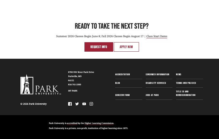
Park University has a lot to hold together. A flagship campus in Missouri, a second in Arizona, locations on military bases around the country, and a full online program. The homepage pulls it off without strain. Apply, Request Info, and Plan a Visit share the nav, and separate panels send undergrads, grad students, transfers, military families, and working adults down their own path. Park ties Boise State at 3.67 and takes second on branding, our tiebreaker after user experience came out even.
Here’s how it scored:
- UX and navigation (5/5). Three conversion actions in the nav, a clear Academics path, and audience panels built for a multi-campus and online model.
- Accessibility (4/5). Automated score of 92 with a few minor items flagged.
- Branding (4/5). A steady maroon-and-gold system with confident display type, held back by uneven photography.
- Load speed (3/5). Lighthouse 50 on mobile, second-best of the group, though field data fails Core Web Vitals.
- Site health (3/5). 84 percent, with the best crawlability score here (99) and only 207 warnings. The 77 errors are high for a site this size and point to one systematic issue repeating.
- AI search health (3/5). 80 percent.
- AI visibility (context, not scored): 37, on 692 mentions and 530 cited pages, the smallest AI footprint of the eight and a function of regional reach.
3. Providence College


Platform: WordPress 6.9.4. Verified July 2026.
Overall: 3.50 / 5
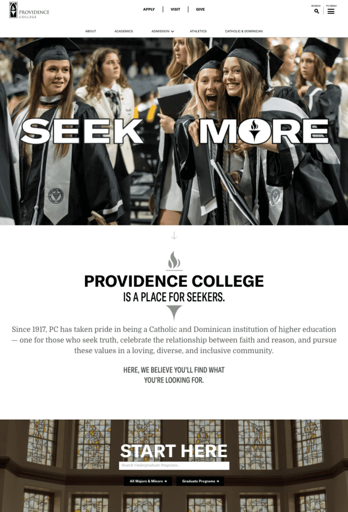
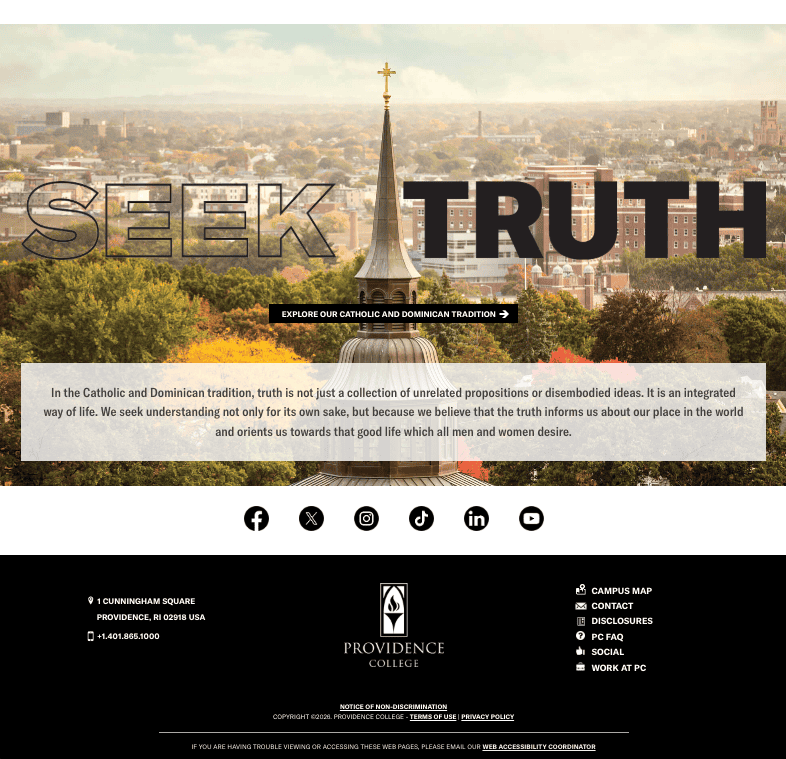
Providence College out-designs institutions many times its size. A restrained palette of black, white, and gold incorporates the flame mark directly into the “SEEK MORE” headline rather than stamping it on top. Admission splits into undergraduate and graduate and then gets out of the way. Behind the scenes it sits right behind Boise State, and it’s the third institution in a row to prove the same point about size.
Here’s how it scored:
- UX and navigation (4/5). A short Admission path split by undergraduate and graduate inside a focused small-site structure, though cost and outcomes are nested a level down.
- Accessibility (5/5). Automated score of 100, and it holds up on the manual pass.
- Branding (5/5). A disciplined black, white, and gold system, the flame mark woven into the wordmark and headlines, and art-directed original photography.
- Load speed (1/5). Lighthouse 49 on mobile, one point under the band line, while field data passes Core Web Vitals.
- Site health (3/5). 84 percent on only 9 errors, weighed down by 938 warnings from on-page volume.
- AI search health (3/5). 80 percent.
- AI visibility (context, not scored): 62, on 1,900 mentions and 1,100 cited pages.
4. University of North Carolina at Chapel Hill
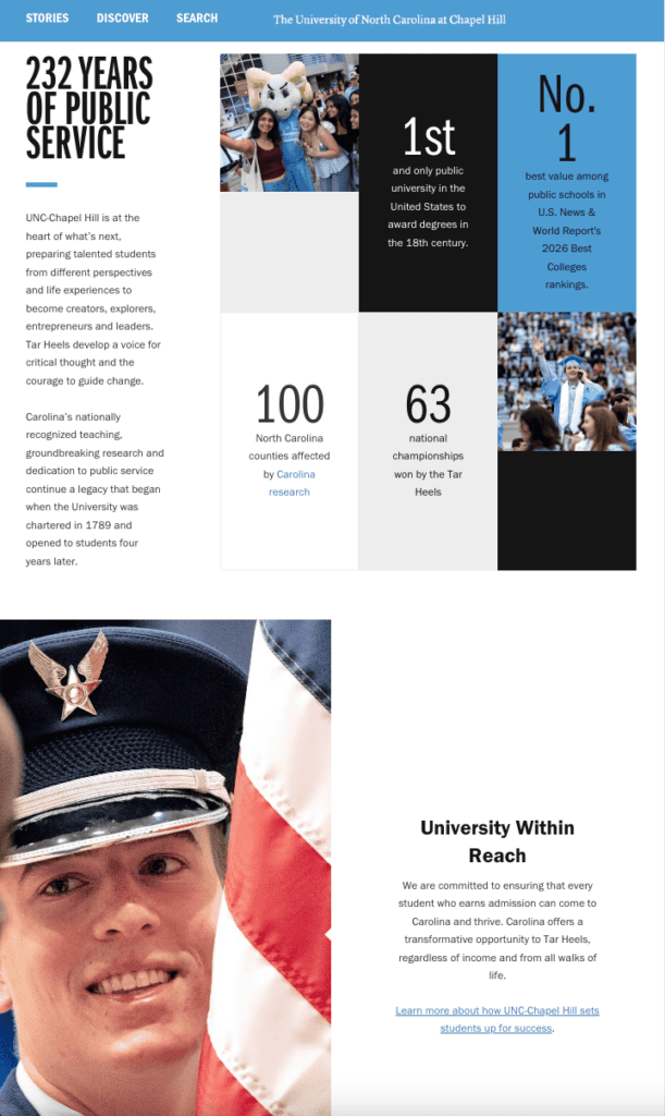


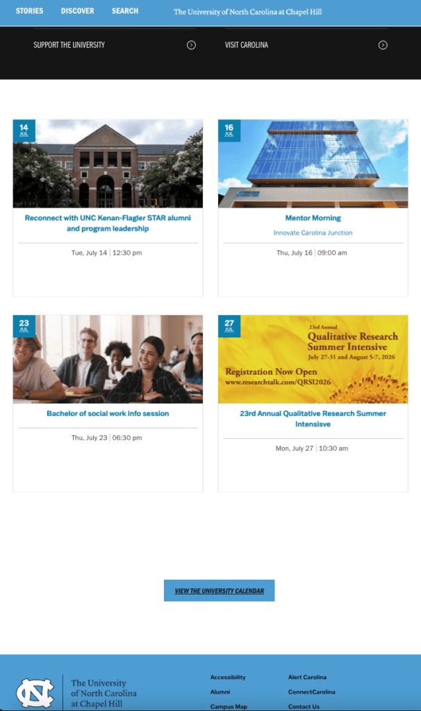

Platform: WordPress (custom theme). Verified July 2026.
Overall: 3.33 / 5
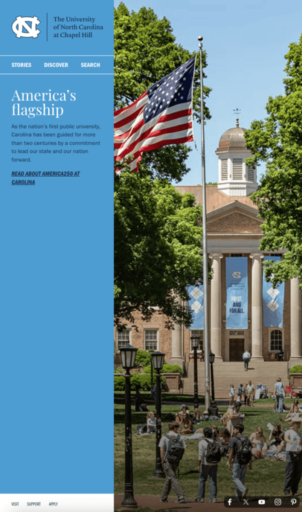
The University of North Carolina at Chapel Hill commits fully to Carolina blue, backs it with original photography, and writes copy self-assured enough to say ‘America’s flagship’ out loud. UNC earns its branding score. Admissions and Aid share one nav item, so cost surfaces early, and a dedicated Accessibility link sits in the top nav, which most institutions skip. The trouble is under the floorboards. Site health comes in at 69 percent on 26 errors and 770 warnings. A prospective student never sees your site health score, but they feel the site it produces.
Three institutions tie at 3.33. UNC leads the group on branding, with field Core Web Vitals giving it the edge.
Here’s how it scored:
- UX and navigation (4/5). One Admissions and Aid path that covers cost, plain labels throughout, and an Accessibility link in the main nav. A distinct outcomes route is missing.
- Accessibility (4/5). Automated score of 93 with contrast issues flagged.
- Branding (5/5). A single-color Carolina blue system, original photography, a consistent logo, and an editorial voice with a point of view.
- Load speed (3/5). Lighthouse 57 on mobile, and field data passes Core Web Vitals.
- Site health (1/5). 69 percent, below the band, on 26 errors and 770 warnings.
- AI search health (3/5). 81 percent.
- AI visibility (context, not scored): 70, on 30,100 mentions and 19,700 cited pages.
5. Northeastern University
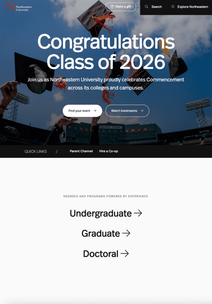

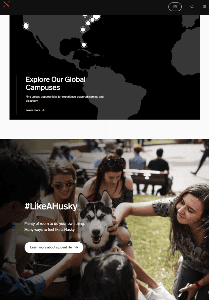


Platform: WordPress. Verified July 2026.
Overall: 3.33 / 5
Northeastern goes all in on brand, and it works. Red, black, and white held tight, oversized custom type, a global campus map, and a Global News sub-brand with more personality than most university homepages permit themselves. Admissions leads the nav with a simple undergraduate and graduate split. Then the bill arrives. That image-heavy homepage posts a Lighthouse score of 7, the lowest of the eight, and field data confirms visitors feel every second of it.
Here’s how it scored:
- UX and navigation (4/5). Admissions leads the nav with an undergraduate and graduate split, while cost and outcomes paths sit lower.
- Accessibility (4/5). Automated score of 93 with a few minor items flagged.
- Branding (5/5). A restrained red, black, and white palette, custom display type, the Global News sub-brand, and consistent original photography.
- Load speed (1/5). Lighthouse 7 on mobile, a 29.5-second Largest Contentful Paint in the lab, and a Core Web Vitals failure in the field. The hero image is the main culprit.
- Site health (3/5). 72 percent on 32 errors and 512 warnings.
- AI search health (3/5). 77 percent.
- AI visibility (context, not scored): 79, the highest of the eight, on 13,600 mentions and 11,500 cited pages, built on brand strength ahead of sheer volume.
6. Harvard University

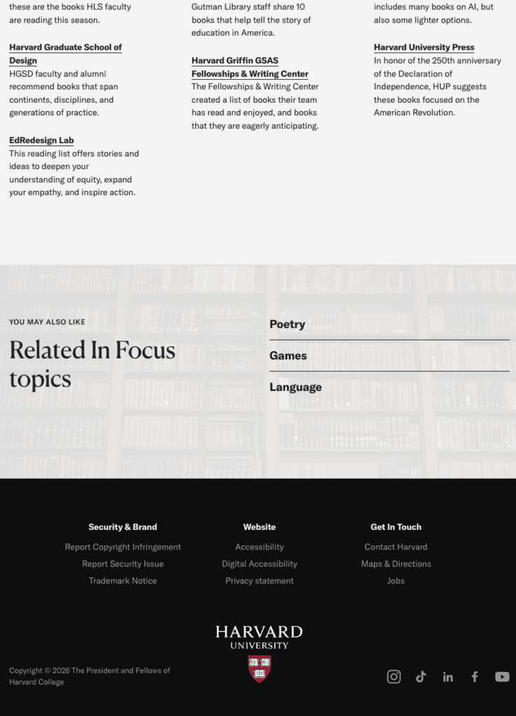

Platform: WordPress. Verified July 2026.
Overall: 3.33 / 5
Harvard runs the oldest university in the country on WordPress, which surprises people who assume Cambridge must be sitting on something bespoke.
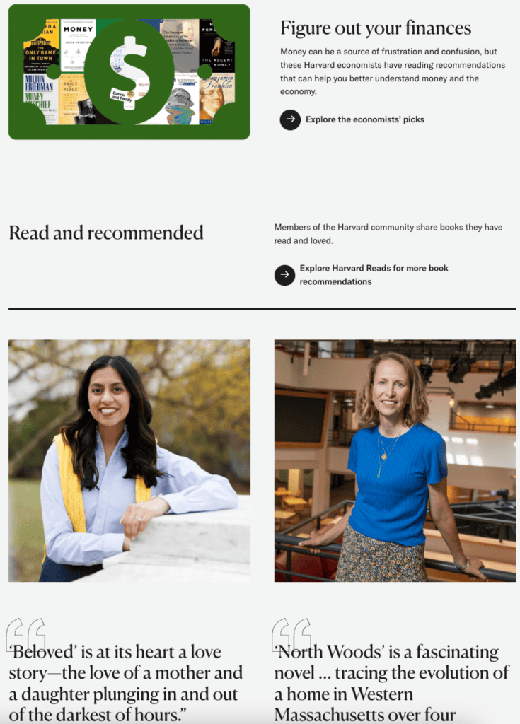
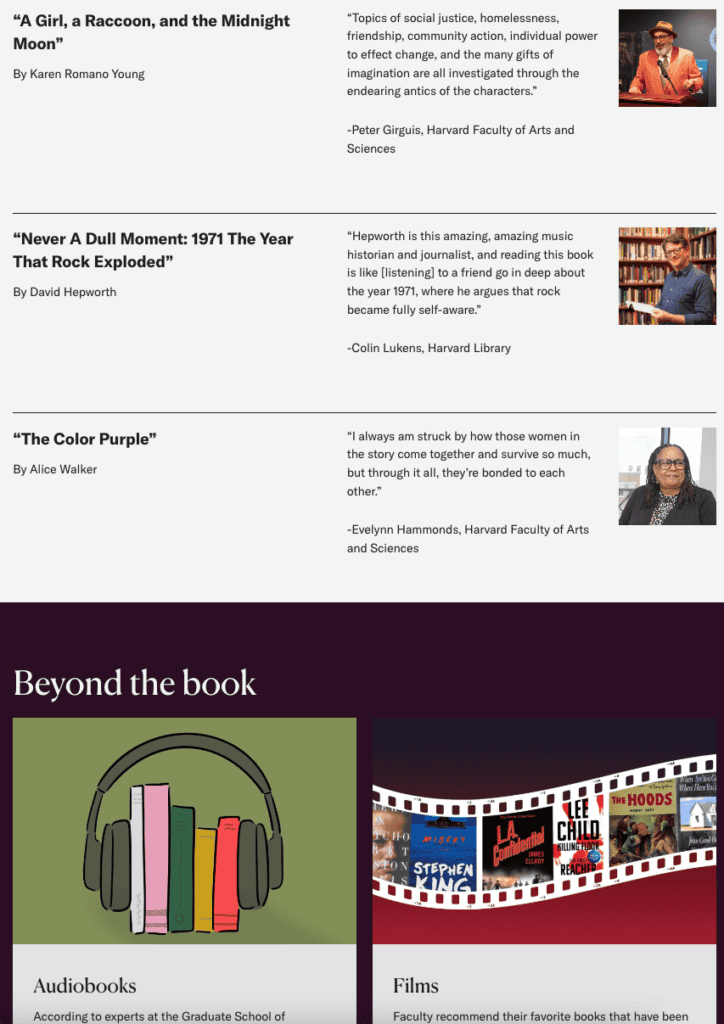
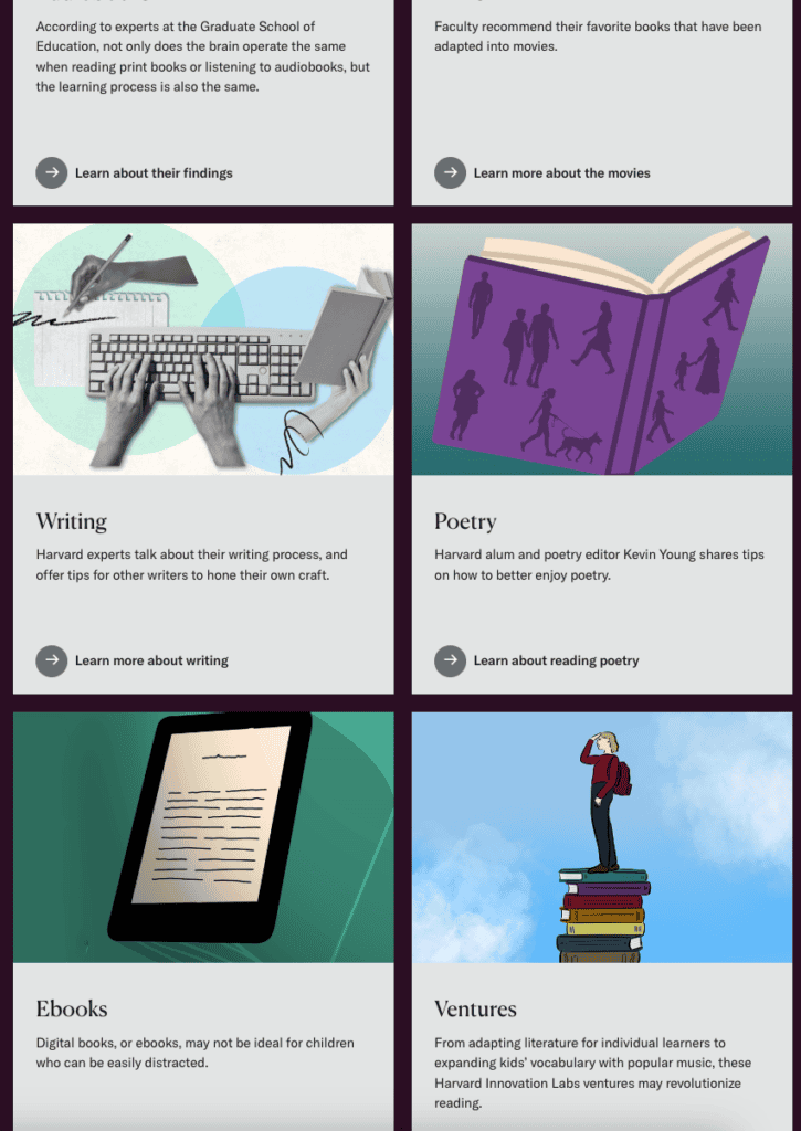
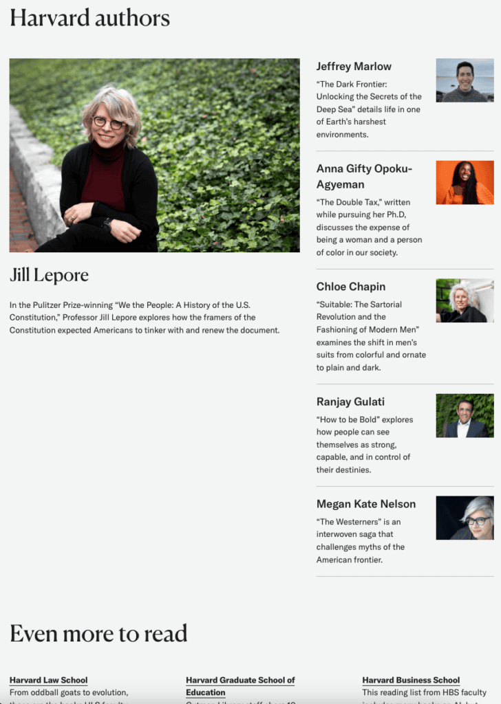
It also breaks our methodology, so we want to be upfront about how. Harvard doesn’t keep a conventional homepage the way the other seven do. Harvard.edu is an editorial front door that rotates through a series of featured stories, and on the day we scored it, the homepage led with a summer reading package: book recommendations from faculty, librarians, and staff sorted into beach reads, mysteries, and literary fiction. Harvard files these features in an “In Focus” section of the site, which tells you the rotation is deliberate rather than a one-time takeover.
All of this tells you something bigger. Harvard’s homepage isn’t trying to recruit anybody. Its schools admit separately, so there’s no Apply hero to grade, no cost and aid path in the primary nav, and no outcomes route. The page is doing brand work, and it does that beautifully. A serif type system, a distinctive flame logo, and editorial photography give it the polish of a magazine spread.
We scored what was live, and it costs Harvard on user experience (3/5). Read that number as the price of a design choice with a luxury sitting underneath it. When 222,000 AI mentions and four centuries of name recognition already do your recruiting, your homepage gets to spend July talking about beach reads. Almost nobody else on this list can say the same. Borrow the magazine approach without the fame holding it up, and the applicant closes the tab.
Here’s how it scored, on the live seasonal feature:
- UX and navigation (3/5). A clear Academics and Degree programs path plus Visit in the nav, though book-discovery content leads and there’s no prominent Apply action.
- Accessibility (4/5). Automated score of 96, with a contrast failure on the feature’s dark section titles.
- Branding (4/5). A flame logo, a serif system, and editorial photography that reads like a magazine spread.
- Load speed (3/5). Lighthouse 74 on mobile, the best of the eight, and field data passes Core Web Vitals.
- Site health (3/5). 79 percent on only 3 errors, with 646 warnings from on-page volume.
- AI search health (3/5). 79 percent.
- AI visibility (context, not scored): 76, on 222,000 mentions and 107,000 cited pages, by far the largest AI footprint here.
7. Georgia State University
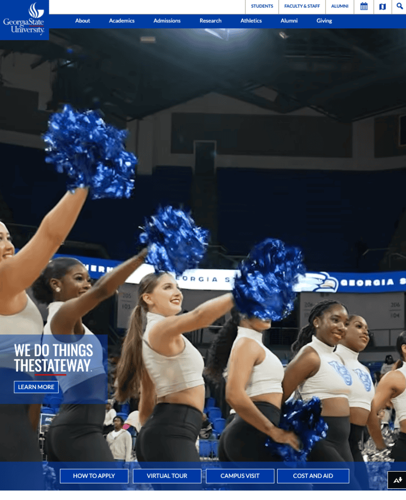


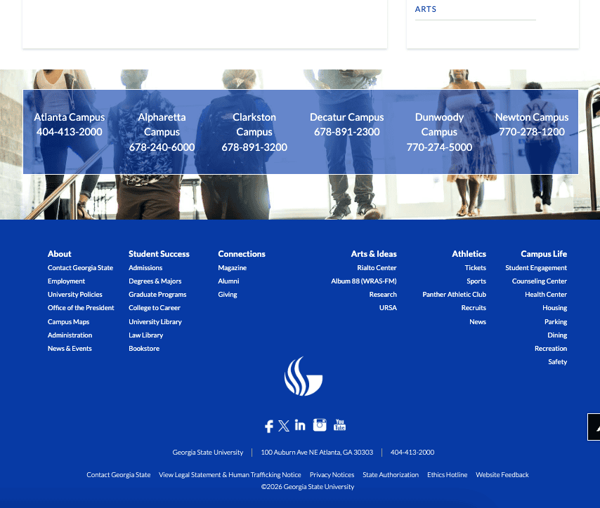

Platform: WordPress. Verified July 2026.
Overall: 2.83 / 5
Georgia State gets the prospective-student basics right and then some. How to Apply, Virtual Tour, Campus Visit, and Cost and Aid all sit up top, next to a Find Your Field of Study tool that helps someone narrow down their options before they ever talk to a human. The blue holds together, though the template shows through in unstyled form controls. Then you open the audit. Georgia State’s audit is the messiest of the eight, and its mobile visitors fail Core Web Vitals. The strategy here is sound, but the plumbing needs a weekend.
Here’s how it scored:
- UX and navigation (4/5). Prospective-student actions up top and a Find Your Field of Study tool, though the nav serves current students at the same time.
- Accessibility (5/5). Automated score of 100, tied for the tidiest pass of the group.
- Branding (3/5). A consistent blue palette, a tagline with some swagger, and original campus imagery, sitting inside a template-driven layout.
- Load speed (1/5). Lighthouse 38 on mobile, a 17.5-second Largest Contentful Paint, and a Core Web Vitals failure in the field.
- Site health (1/5). 67 percent, on 89 errors and 1,551 warnings, the heaviest load of the eight.
- AI search health (3/5). 79 percent.
- AI visibility (context, not scored): 71, on 8,900 mentions and 8,300 cited pages.
8. University of Washington
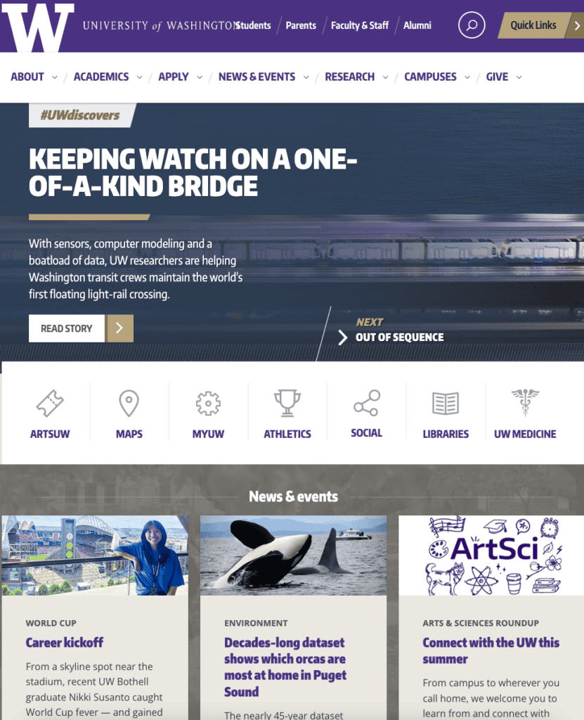


[Semrush Site Audit screenshot | alt: “Semrush Site Audit results for University of Washington”] Platform: WordPress 6.9.4. Verified July 2026.
Overall: 2.67 / 5
Washington closes the list, and it isn’t for lack of taste. Purple and gold hold together, the Be Boundless voice resonates, and audience gateways for students, parents, and alumni make Academics simple to move through. Two things drag the score down. The homepage gravitates toward research and news, so admissions and cost sit further down than a 17-year-old prospective student will typically look. And the speed here is a real problem. Around 5 MB of page weight, a 32.7-second Largest Contentful Paint, and a Core Web Vitals failure in the field point to a slow experience that real visitors feel.
Here’s how it scored:
- UX and navigation (3/5). Audience gateways aid self-selection and Academics is well organized, though admissions and cost sit outside the primary nav.
- Accessibility (4/5). Automated score of 96, with the search bar hidden from screen readers while still focusable.
- Branding (4/5). A purple-and-gold identity that holds up, with original photography, inside a conventional layout.
- Load speed (1/5). Lighthouse 36 on mobile, roughly 5 MB of page weight, and a Core Web Vitals failure in the field.
- Site health (1/5). 66 percent, the lowest of the eight, on 35 errors and 996 warnings.
- AI search health (3/5). 79 percent.
- AI visibility (context, not scored): 69, on 29,900 mentions and 22,800 cited pages.
The Full Scorecard
| Rank | Institution | UX | Access | Brand | Speed | Site Health | AI Search | Overall |
| 1 | Boise State | 5 | 5 | 5 | 1 | 3 | 3 | 3.67 |
| 2 | Park | 5 | 4 | 4 | 3 | 3 | 3 | 3.67 |
| 3 | Providence | 4 | 5 | 5 | 1 | 3 | 3 | 3.50 |
| 4 | UNC Chapel Hill | 4 | 4 | 5 | 3 | 1 | 3 | 3.33 |
| 5 | Northeastern | 4 | 4 | 5 | 1 | 3 | 3 | 3.33 |
| 6 | Harvard | 3 | 4 | 4 | 3 | 3 | 3 | 3.33 |
| 7 | Georgia State | 4 | 5 | 3 | 1 | 1 | 3 | 2.83 |
| 8 | University of Washington | 3 | 4 | 4 | 1 | 1 | 3 | 2.67 |
What Do the Scores Reveal About WordPress University Websites?
The top three spots went to a regional public university, a private college of about 5,000 students, and a multi-campus institution built around working adults. The research flagships followed them. That result has three mechanisms behind it, and none of them is about budget.
- The smaller homepages have one job. Boise State, Park, and Providence use the front door to recruit. The flagships use it to recruit, announce research, serve current students, court donors, and publish news. Every audience added to a homepage costs a prospective student a click.
- Fewer content types means healthier technical foundations. The three institutions at the top scored between 84 and 86 percent for site health. The four flagships came in between 66 and 72 percent. Scale brings sprawl, and sprawl brings errors.
- Discipline reads as confidence. Boise State’s angled banner and Providence’s flame mark do more brand work than any hero video in the group.
Speed is where the whole field left something behind. Nobody reached the top band, and the lab and the field tell different stories worth separating. Boise State, Providence, UNC, and Harvard post rough Lighthouse numbers and still pass Core Web Vitals for actual visitors. Park, Northeastern, Georgia State, and Washington fail in the field, which means their applicants are waiting.
Accessibility, on the other hand, is the group’s best category. Three perfect automated scores, nothing below 92, and a dedicated Accessibility link in UNC’s global nav. Higher education has taken this one seriously, and it shows.
AI search health barely moved, from 77 to 83 percent, so all eight are legible to AI crawlers today. The spread lives in AI visibility, which runs from Harvard’s 76 down to Park’s 37 and tracks name recognition far more than site quality. Being readable by AI gets you in the room. Being cited is a separate project.
WordPress vs. Drupal for Higher Ed: Which Is Better?
Two content management systems keep showing up on university websites, and the choice between them comes down to how a team works.
Drupal earned its place. It handles complex content structures and granular permissions well, which suits large research institutions with hundreds of content types and strict governance, and its security model has a long track record in government and education.
WordPress makes a different trade. The editing experience is approachable enough that faculty and staff can publish without a developer in the loop, the ecosystem solves common needs (forms, events, accessibility tooling, SEO) without custom code, and the talent pool is wide enough that hiring costs less. For a communications team that publishes constantly, those savings compound.
Here’s the honest guidance. If your site depends on deeply custom content modeling and you employ the developers to maintain it, Drupal is a fine home. If you want publishing speed, editor independence, and a lower total cost of ownership, look hard at WordPress, which handles enterprise scale far better than its blog-era reputation suggests. Our WordPress for Higher Ed team can walk you through what a move would involve for your site.
FAQs
Do top universities really use WordPress?
Yes, top universities really use WordPress for their websites. All eight institutions in this review run WordPress on their primary homepage, including Harvard, UNC Chapel Hill, and the University of Washington, and many more use it across departments, research groups, and student publications.
Is WordPress secure enough for a university website?
Yes, WordPress is secure enough for a university website. WordPress meets the security and compliance bar higher education requires, including WCAG and FERPA obligations, when it’s hosted and maintained properly. Managed hosting built for education and a disciplined update process do most of the work.
What makes a university website good?
What makes a university website good depends on many different factors. For example, a prospective student should be able to reach programs, admissions, cost and aid, and outcomes quickly. Beyond that, the site should be accessible, fast on a phone, technically healthy, and readable by AI search tools. Those are the six things we scored here.
How do I check what my own site scores?
You can check your university’s website score by running the same tests. A Lighthouse report on the mobile profile for speed and accessibility, a Semrush Site Audit for technical and AI search health, and a walk through your own navigation as if you were a 17-year-old prospective student. Our AI-Ready University Website Audit covers the AI search half in depth.
Should our institution move from Drupal to WordPress?
Whether your institution should move from Drupal to WordPress depends on how custom your content model is and how much developer capacity you have. Read the WordPress vs. Drupal section above, then get in touch for a recommendation on your site.
Ready to Score Your Own Site?
The eight institutions here show what WordPress can do at any size. The ones that scored highest put the prospective student first, keep the technical foundation healthy, and make sure AI tools can read them. Everything else is decoration.
You can run these tests on your own homepage this afternoon. If you’d rather see the whole picture at once, reach out and we’ll show you where your site lands on all six measures.