A vital element of your website’s conversion strategy are its call-to-action buttons, or CTAs. If your CTAs aren’t converting, you are losing leads and hurting your business. In this post, we’ll cover what a CTA is and how to design successful call-to-action buttons. In later posts, we’ll delve deeper into the content side of things, but for now we’ll focus on the design of the CTA button itself.
What is a CTA?
A Call-to-Action (CTA) on a website refers to the area that is designed to get a click, or conversion, and often refers to the call-to-action button itself. The desired conversion might be signing up for your email newsletter, downloading a piece of premium content such as an ebook or white paper, or following you on Facebook, Twitter, LinkedIn or other social media channels.
Regardless of the preferred type of conversion, a CTA’s design has an undeniable influence on whether a user will take the desired action or not.
Let’s take a look at seven design elements to consider when designing a CTA and call-to-action buttons. We’ll call out the “oversimplified highest performers” for each element—but by no means will the average high performer work best for every website. Consider your overall conversion strategy and test various options to find out what performs best for your specific goals.
1. SHAPE
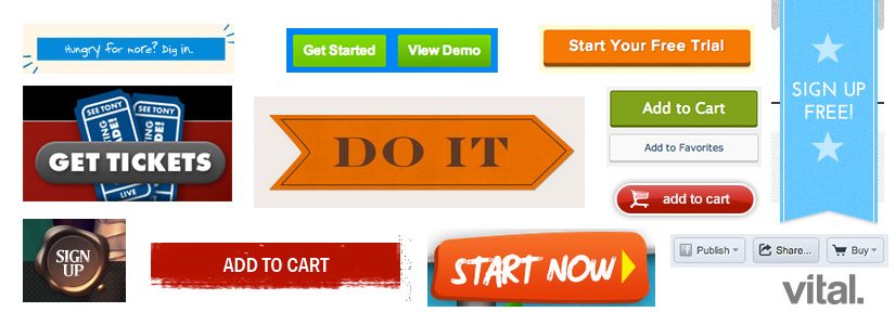
Rectangle and pillbox are the two most common shapes for CTA buttons, but you will also find them in square, circle, starburst, octagonal and any other shape possible. “The eye is drawn to circles and the information contained within, and they are faster and easier for the brain to process than hard-edged squares and rectangles.” — Sarita Harbour, Web Designer Depot
Add to this the fact that our eyes may be more apt to look out for a larger, more rectangular shape, and it’s easy to see why a rectangular button with rounded edges tends to be the most common button shape out there. The best of both worlds wins.
Oversimplified Highest Performer: Pillbox
Why? It gracefully combines the familiarity of a rectangle and the visual ease of a circle.

2. SIZE
When it comes to call-to-action button sizes, bigger is almost always better—within reason. You should have one primary conversion on each page, and that one conversion click should be easy to make. You know that this is true if you’ve ever tried to register for something on your mobile device only to give up and decide to try later on your desktop. Make it easy for someone to convert, from any device!
Make it easy for someone to convert, from any device.
Oversimplified Highest Performer: Big
Why? It is easier to see and click.

3. COLOR
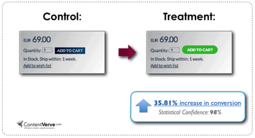
The right color choice for your call-to-action buttons depends on the palette of other elements of your website. Green may stand out in one color scheme, or disappear in another. As a rule, bright, contrasting colors that stand out from background tend to have a higher conversion rate.
Oversimplified Highest Performing call-to-action button: Red, followed by green
Why? It’s usually the easiest to see.

![How to Make a Content Style Guide as Unique as Your Brand [w/ Free Template!] 6 content-style-guide](https://vitaldesign.com/wp-content/uploads/2018/05/content-style-guide-818x596.jpg)