Perkins Access
A Website Redesign for the Brand that Sets the Standard for Digital Accessibility
Scope

Project Overview:
Perkins Access is on a mission to build a more accessible digital world, partnering with organizations of all kinds to help them create digital products, services, and experiences — including websites, apps, multimedia, and beyond — that engage and include all people, regardless of their abilities.
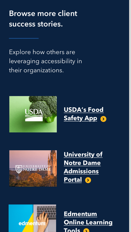
Perkins Access was saddled with a dated, disorganized website that made it next to impossible for their team to update content. They came to Vital looking for a complete makeover, inside and out.
Starting from Scratch
The Vital team began with a site audit to take stock of Perkins Access’ existing content. There was a lot of it, and the site’s disorganization and confusing navigation didn’t do their users any favors. Through intensive site and content mapping, our team was able to establish the architecture for a easy-to-navigate site. We built a backend that empowers both their team and ours to easily update content, paving the way for future digital marketing efforts to draw more users to the site
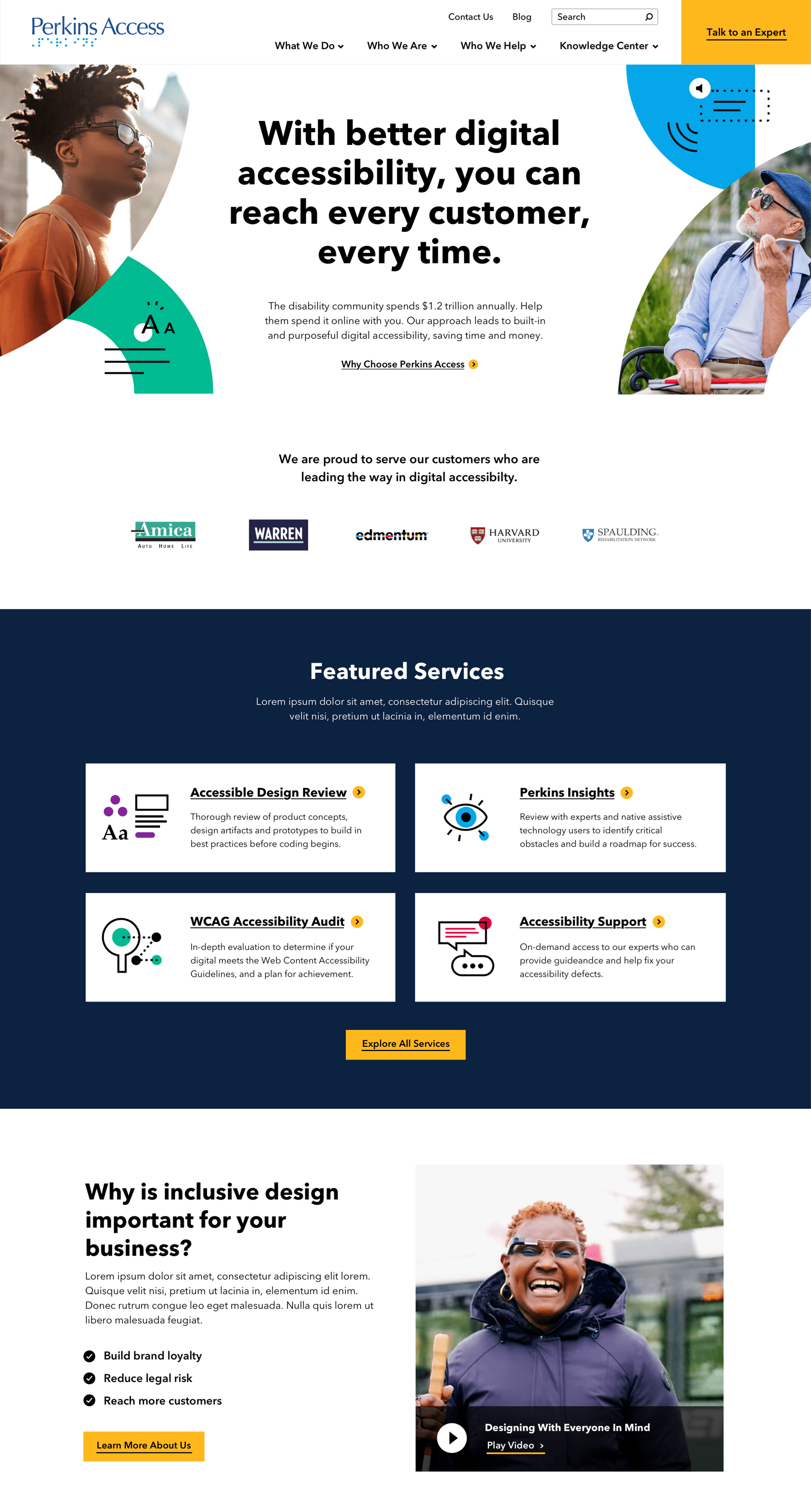
AAA WCAG Accessibility meets design and UX best practices
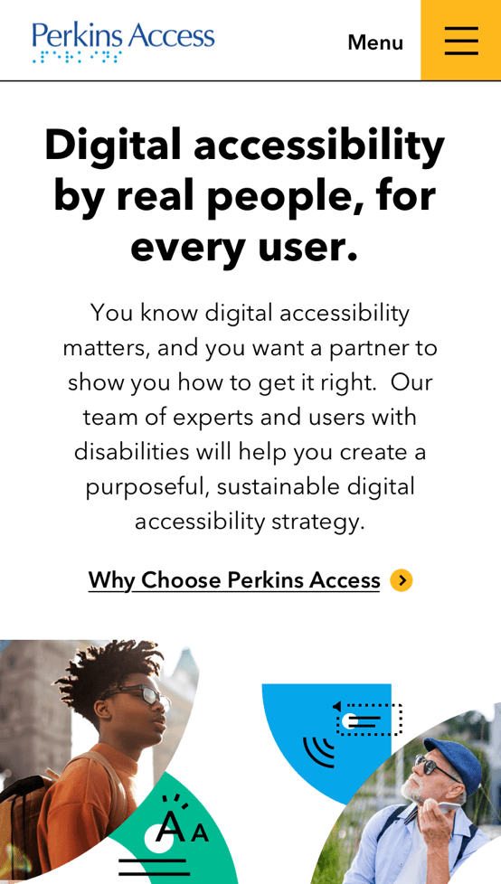
Over the course of our work with Perkins Access, we proved to ourselves that an accessible website does not have to sacrifice beautiful design or an intuitive user experience. Perkins Access serves customers who are “leading the way in digital accessibility,” and their new website brings that mission to life. The site is AAA WCAG compliant — the highest possible standard for digital accessibility.
This means the Perkins Access website is designed to be:
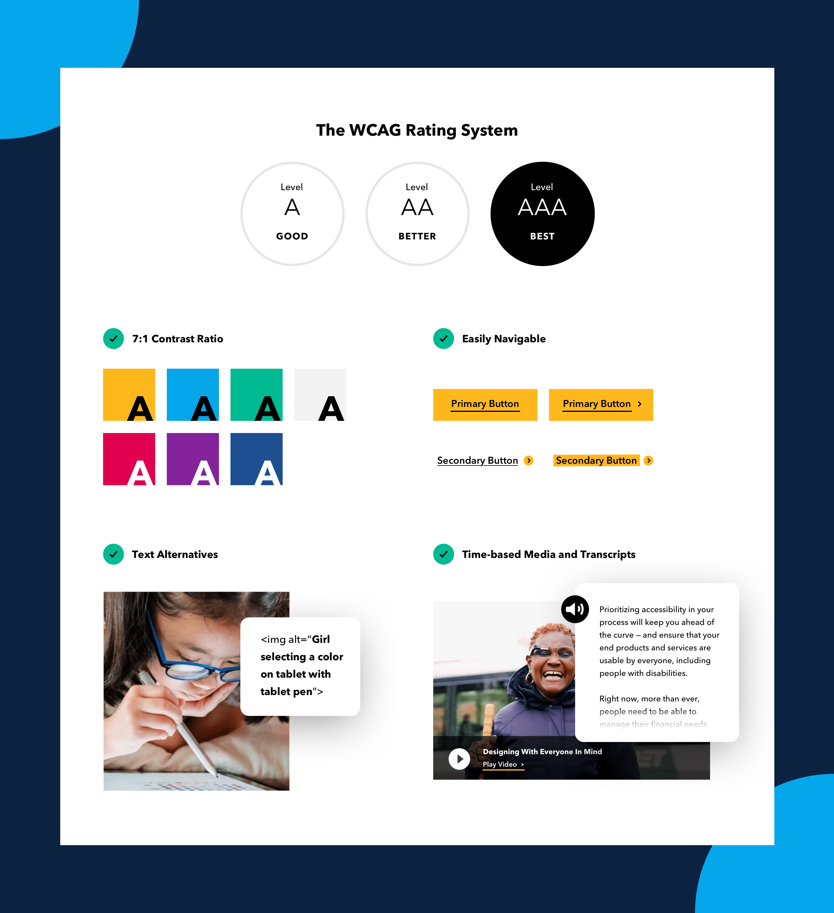
Perceivable
Perkins Access meets the standards for perceivability by:
– Providing text alternatives for any non-text content. These alternatives allow users to change non-text content into whatever form they need, including large print, braille, speech, and symbols.
– Providing alternatives such as captions, descriptions or audio, or other media alternatives for any “time-based media,” such as videos or audio files.
– Creating content that can be adapted to alternative forms without sacrificing information or organization.
– Choosing contrast, text size, and audio that make it easier for users to see and hear content.
Operable
The new website makes it easier for users to operate by:
– Ensuring that the site can be navigated using only a keyboard.
– Giving users enough time to read and use moving, blinking, scrolling, auto-updating, or time-limited content.
– Designing content to avoid known triggers for seizures or other physical reactions.
– Making sure the UI (including information architecture, titles, headers, and labels) allows users to navigate and find the content they need.
– Providing ways for users to interact with content with a variety of non-keyboard inputs
Understandable
The redesign ensures that content on the site is easy to understand, by:
– Making text content readable and comprehensible.
– Ensuring that web pages operate predictably and consistently.
– Providing “input assistance,” such as instructions and suggestions, to help users avoid and correct errors when inputting information.
Robust content keeps users engaged
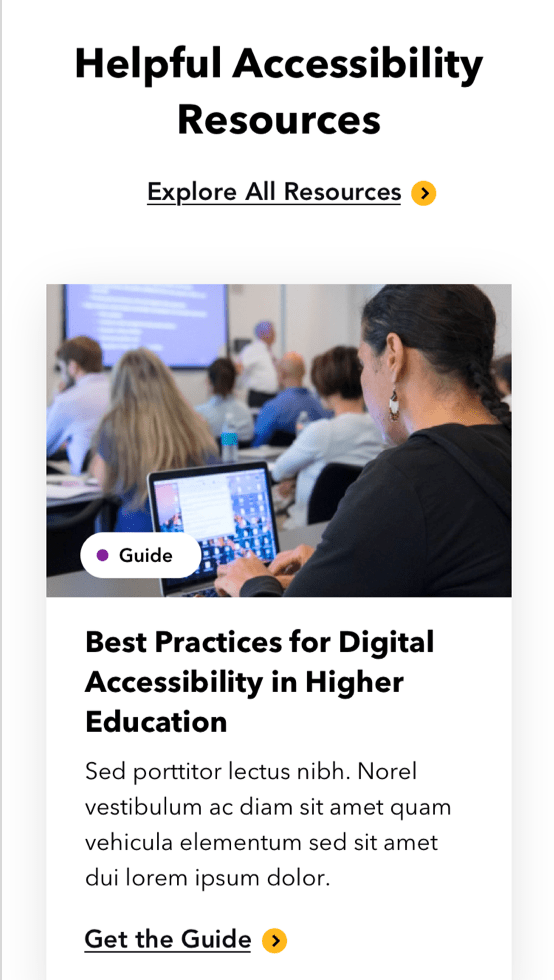
Perkins Access already had a wealth of in-depth content, and they needed a way to surface their resources so they weren’t going to waste. Vital built a Knowledge Center that combines blog posts with other content resources. All the content is easy to browse, search, sort, and filter, so users can easily find the stories, guides, and webinars that match their interests.
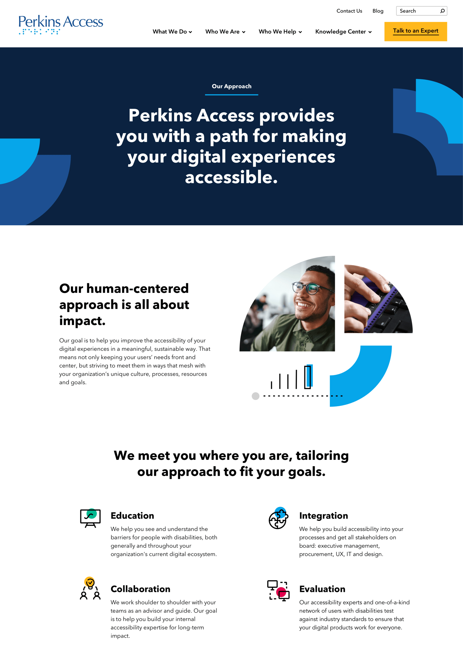
Mobile Designs

Related Projects
Ready to Start A Project?
Let’s do this! We can’t wait to hear about what you’ve got planned. Fill out the form below and let’s get started.
